11 Creative Kitchen Colour Combinations That Cut Clutter Fast
A cluttered kitchen isn't always about too many things on the counter. Sometimes it's the colours competing for attention that make the room feel chaotic. The right palette can trick the eye into seeing more order, even when life gets messy.
Modern kitchens thrive on simplicity, but that doesn't mean boring. By pairing smart hues with clean lines, you can create a space that feels both stylish and serene. These 11 colour combinations are chosen to minimize visual noise while maximizing personality.
From soft neutrals to bold accents, each idea is designed to help your kitchen breathe easier. No complicated rules—just practical, Pinterest-friendly pairings that actually work in real homes.
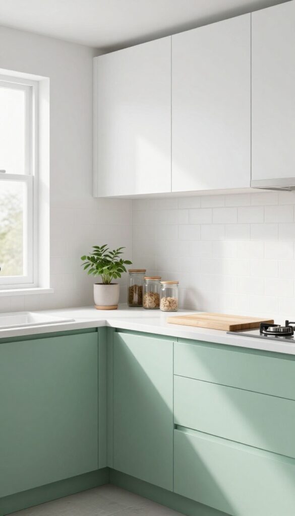
1. Warm White and Sage Green
Sage green has become a go-to neutral in modern kitchens, and for good reason. It brings a natural, calming energy without feeling cold or sterile. Pairing it with warm white uppers keeps the space bright and open, while the green grounds the room and adds depth.
The contrast is soft but intentional, making the kitchen feel both fresh and settled at the same time.
Why It Works
Dark lower cabinets anchor the visual weight of the kitchen, so your eye naturally moves upward to the lighter white cabinets. This upward pull makes the ceiling feel higher and reduces the sense of clutter because there's less visual busyness at eye level. The sage green also hides everyday smudges better than white or dark colors.
Best For
This combination works beautifully in kitchens with limited natural light, because the warm white reflects whatever light is available. It's also ideal for open-plan layouts where you want the kitchen to feel connected to adjacent living spaces without screaming for attention.
Styling Tip
Add brushed brass hardware on both cabinet colors to tie them together. Open shelving in warm wood tones on one wall can break up the cabinetry and add another layer of texture without competing with the color scheme.
2. Charcoal and Natural Wood
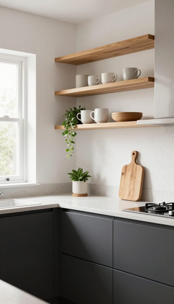
Deep charcoal lowers paired with open wood shelving create a kitchen that feels both grounded and airy. The dark cabinetry anchors the room, hiding everyday smudges and making countertops—especially lighter ones—really stand out. Unfinished wood shelves add warmth without adding visual weight, so the space stays clean and modern without feeling cold or sterile.
Why It Works
The high-contrast combination naturally draws the eye upward, making the ceiling feel higher and the kitchen more spacious. Charcoal absorbs light rather than reflecting it, which minimizes the appearance of clutter on cabinet fronts. Wood introduces organic texture that softens the starkness, so you don't need extra decor to make the room feel inviting.
Best For
This pairing shines in open-plan kitchens where you want a clear visual break between cooking and living zones. It's also ideal for busy households—the dark lowers stay clean-looking longer, and open shelving forces you to keep only essentials visible.
Styling Tip
Stick to warm-toned woods like oak or walnut to prevent the charcoal from feeling too heavy. Keep shelf styling minimal: a few ceramic mugs, a wooden cutting board leaning against the backsplash, and a single trailing plant in a matte pot are enough.
3. Pale Blue and Brass Accents
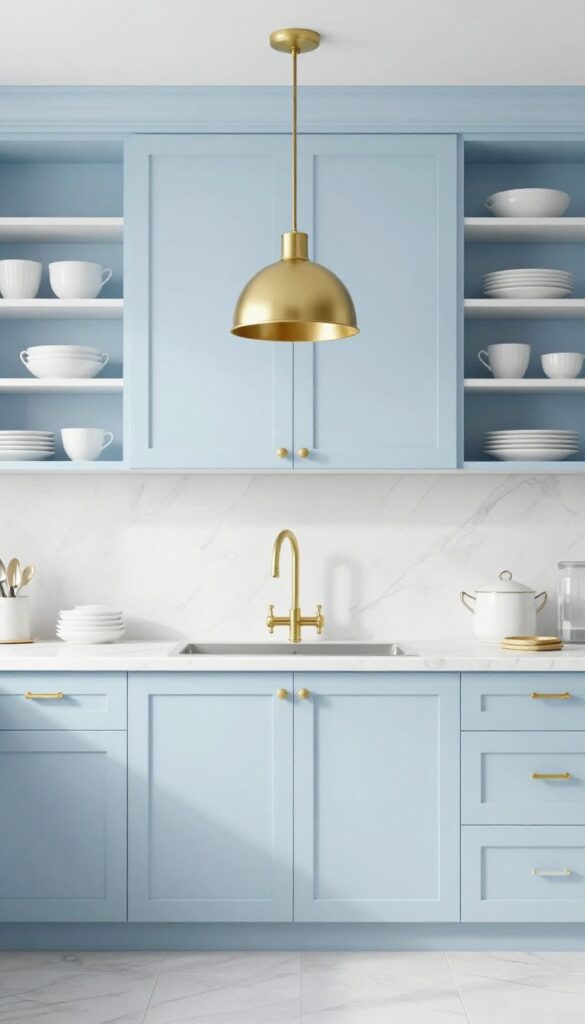
Step into a kitchen where pale blue cabinets stretch from floor to ceiling, and the only sparkle comes from brass handles and a single pendant light. The color feels like a breath of fresh air—calm, airy, and surprisingly spacious. Brass accents add just enough warmth and shine to keep the room from feeling too cool or sterile, creating a balanced look that feels both modern and lived-in.
Why It Works
Pale blue visually expands a small kitchen, making it feel larger and more open. The brass hardware and fixtures introduce subtle contrast without overwhelming the space, giving the eye a place to rest. This combination naturally reduces visual noise because the soft blue acts as a neutral backdrop, while brass provides focused points of interest that don't require extra decor.
Best For
This idea shines in galley kitchens or any narrow layout where you want to avoid a cramped feeling. It also works beautifully in kitchens with limited natural light, as pale blue reflects what light there is and keeps the room bright.
Styling Tip
Stick to unlacquered brass for a warmer, more organic look that develops a gentle patina over time. Pair with white marble or quartz countertops to keep the palette clean. Add open shelving in the same pale blue to display a few white dishes—this reinforces the tidy, uncluttered vibe.
4. Cream and Terracotta
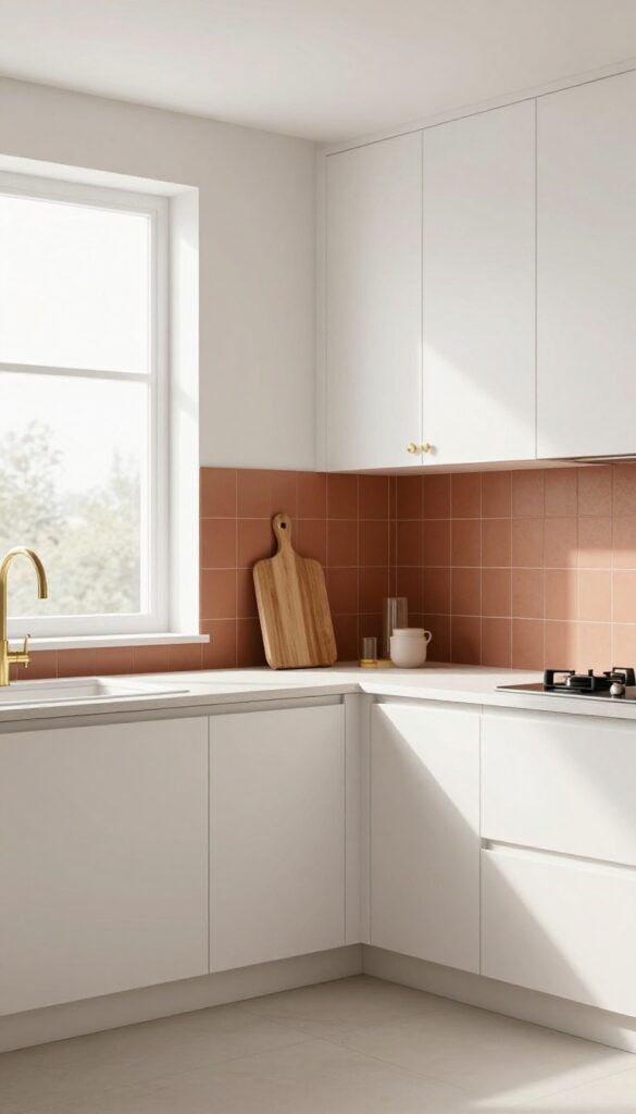
Warm, earthy, and grounding — cream and terracotta is the kind of colour duo that feels like a deep breath after a long day. Creamy cabinetry keeps the kitchen light and open, while terracotta adds a subtle depth that stops the space from feeling flat or sterile. It’s a modern take on natural warmth, where clean lines meet organic texture without any visual noise.
Why It Works
The high contrast between cool cream and warm terracotta creates balance without clutter. Cream reflects light to keep surfaces looking pristine, while terracotta absorbs it, adding richness that makes the room feel lived-in but tidy.
Best For
This combo shines in open-plan kitchens where you want warmth without overwhelming the adjoining living area. It also works beautifully in galley kitchens or smaller spaces because the light base keeps things airy.
Styling Tip
Use matte-finish terracotta tiles on the backsplash or one accent wall — avoid glossy finishes that can feel too busy. Pair with brushed brass hardware and natural wood cutting boards to tie the earthy tones together.
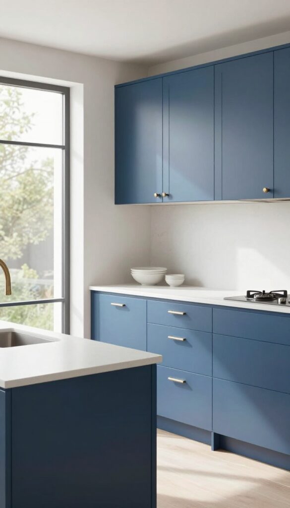
5. Navy and White Marble
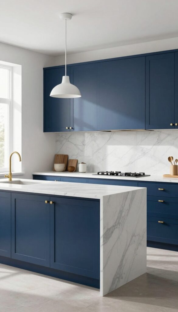
A navy-and-white kitchen feels like a breath of fresh ocean air, especially when you pair deep blue lower cabinets with white marble countertops and backsplash. The contrast is crisp and clean, yet the dark base hides everyday scuffs and splatters better than light cabinetry ever could. Marble’s subtle veining adds just enough visual interest without creating clutter, so the space stays calm and sophisticated.
Why It Works
Navy anchors the room visually, drawing the eye downward and making the kitchen feel grounded. White marble reflects light, keeping the space bright and open, while its natural pattern distracts from messes. This combination reduces visual noise because there’s no busy tile or bold color competing for attention—just two strong elements working together.
Best For
This look shines in kitchens with good natural light, where the navy won’t feel too heavy. It’s ideal for open-plan layouts because it defines the cooking zone without closing off the room. Also works beautifully in smaller kitchens if you keep upper cabinets or open shelving in white to maintain airiness.
Styling Tip
Stick with matte navy paint to avoid fingerprints showing too much. For a cohesive finish, use brushed brass or unlacquered brass hardware—the warm metal pops against the blue and echoes the warm tones in marble. Add a simple white pendant light above the island to keep the focus on the contrast.
6. Soft Gray and Blush Pink
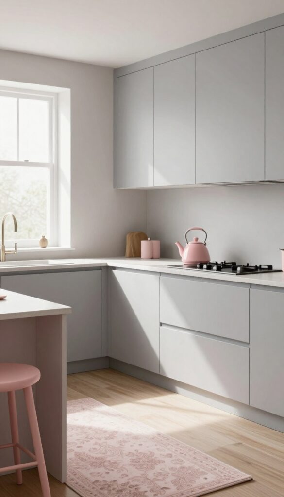
Gray doesn't have to feel cold or sterile. When you pair soft gray walls or cabinets with blush pink accents, the whole kitchen softens. The pink brings a subtle warmth that keeps the space feeling fresh and inviting, not flat.
It's a combination that feels modern but still gentle, like a calm morning light.
Why It Works
The contrast is key: gray grounds the room while blush adds a lift. The pink is just enough to break up the neutrality without creating visual noise. This balance helps the kitchen feel airy and uncluttered, which naturally encourages you to keep countertops clear.
Best For
This palette works beautifully in smaller kitchens or galley layouts where you want to avoid dark or busy colors. It's also ideal for anyone who loves a minimalist look but wants a hint of personality without going bold.
Styling Tip
Start with gray on your main surfaces—walls, cabinets, or even just an island. Then bring in blush through small, functional items like a tea kettle, bar stools, or a patterned rug. Stick to matte finishes for a softer feel.
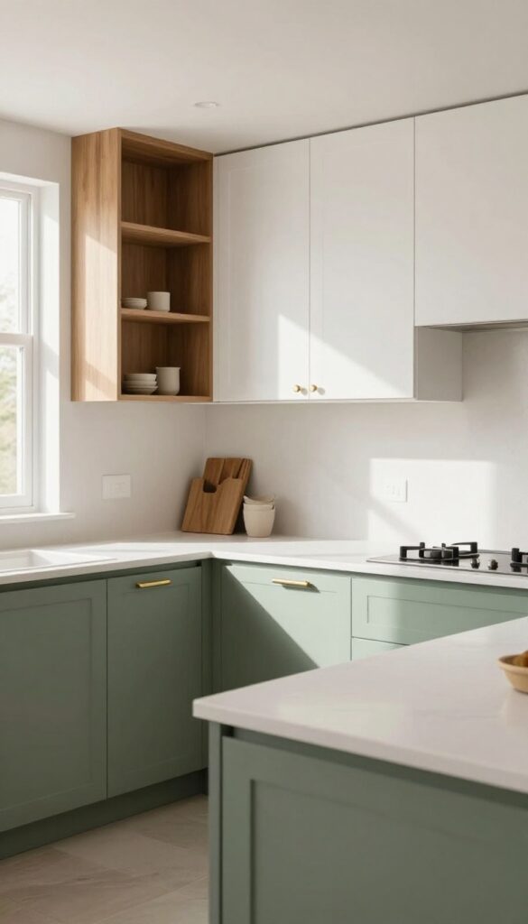
7. Olive Green and Warm Beige
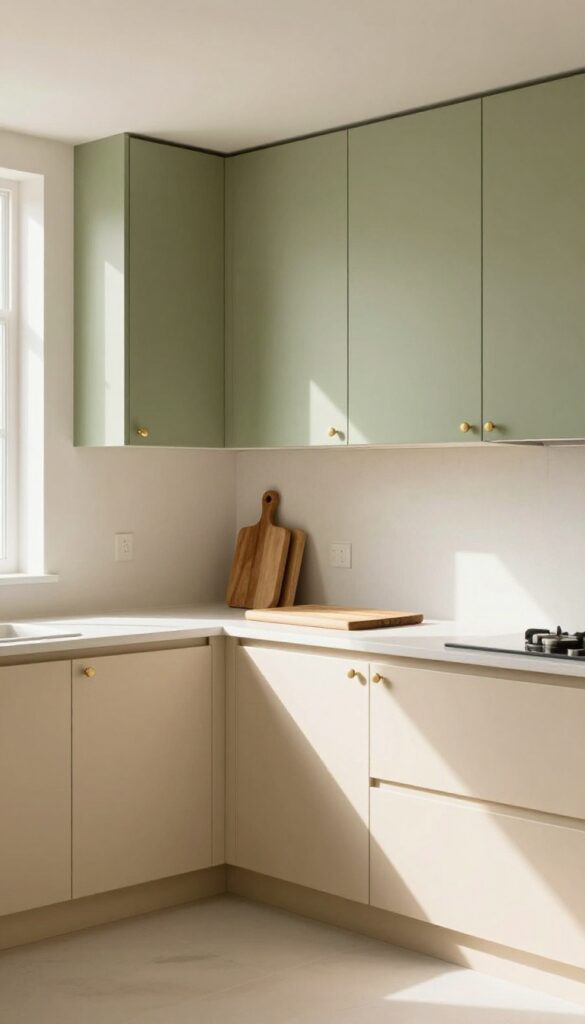
Picture upper cabinets in a soft, earthy olive green paired with lower cabinets in a creamy warm beige. This combination brings the calm of nature right into your kitchen without feeling heavy or dark. The muted tones work together to reduce visual clutter, making the space feel more open and airy even in smaller layouts.
Why It Works
Olive green absorbs light gently while warm beige reflects it, creating a balanced contrast that doesn't fight for attention. The low saturation of both colors means less visual noise, so your counters and backsplash can shine without competition.
Best For
This palette is ideal for kitchens with limited natural light or compact footprints where you want to avoid stark contrasts. It also suits open-plan homes where the kitchen flows into living areas, as the earthy tones transition smoothly into neutral decor.
Styling Tip
Stick with matte finishes on both cabinet colors to keep the look modern and soft. Add brushed brass hardware and a warm wood cutting board for subtle pops of warmth that tie the whole scheme together.
8. White and Black with Wood Accents
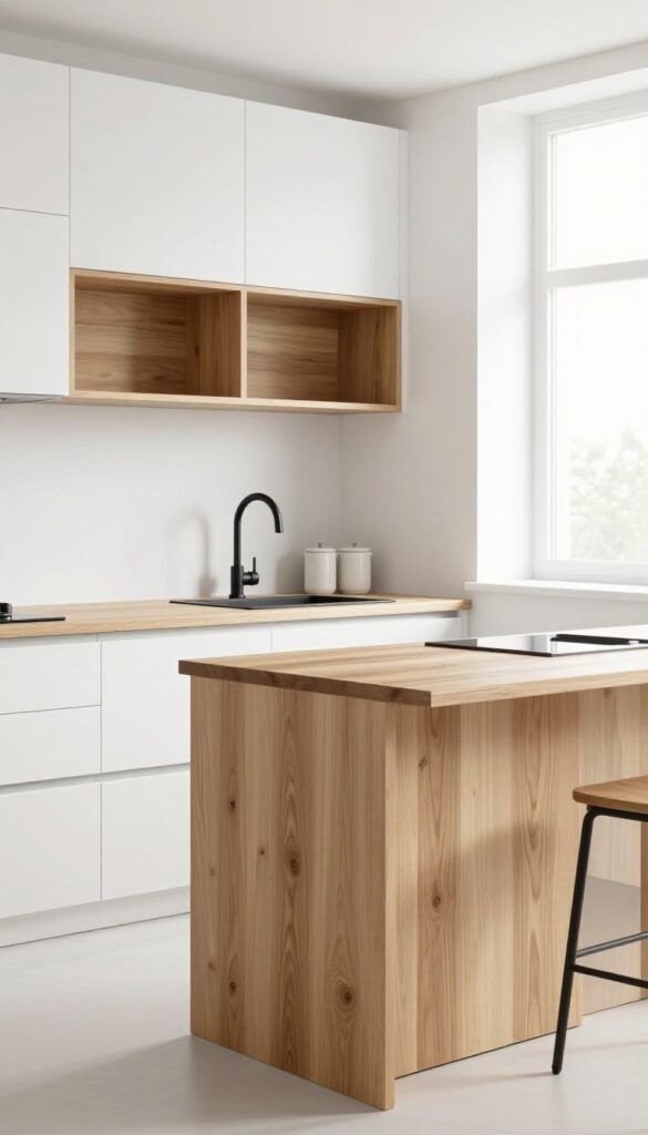
Crisp white cabinets paired with matte black hardware create a clean, high-contrast foundation that instantly reads as modern. Introduce a warm wood island or open shelving, and the space softens without losing its sharp edge. The dark-and-light palette helps define cooking, prep, and storage zones so clearly that your kitchen feels larger and more organized—even before you declutter.
Why It Works
The strong contrast between white and black acts like visual punctuation, guiding the eye to each functional area. Wood adds warmth and texture, preventing the scheme from feeling cold or clinical. This combination naturally reduces visual noise because the distinct color blocks make it easy to process what belongs where.
Best For
Open-plan kitchens where you want to separate cooking zones from dining or living areas without building walls. Also ideal for galley kitchens that need a sense of depth—the dark accents pull the eye along the room while white keeps it feeling airy.
Styling Tip
Choose a single wood tone—like warm oak or walnut—and repeat it on the island, open shelves, and bar stools. Keep counters clutter-free; let the wood grain be the main decorative element. Add a few black ceramic canisters or a matte black faucet to tie the look together.
9. Dusty Rose and Taupe
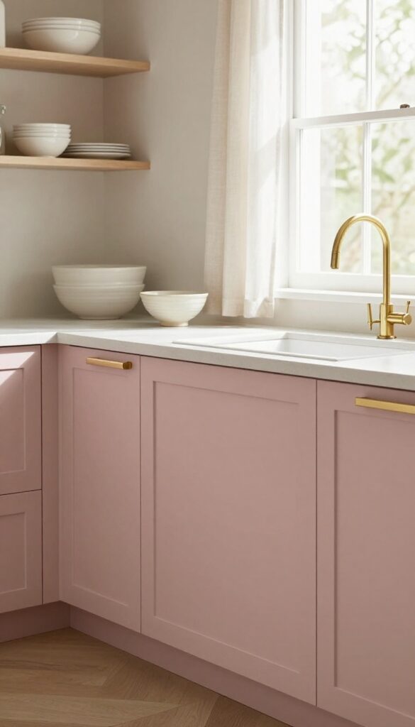
Pair dusty rose with taupe, and you get a kitchen that feels both soft and grounded. The muted pink reads as neutral rather than sweet, while taupe adds a subtle warmth that keeps the space from feeling cold. Together, they create a calm backdrop that actually makes countertops look less cluttered because the eye isn't bouncing between high-contrast colors.
Why It Works
Both colors share beige undertones, so they blend without fighting for attention. That monochromatic harmony reduces visual noise—your brain doesn't have to work as hard to process the space. The result is a kitchen that feels tidy even when life gets messy.
Best For
Open-concept kitchens where you want the cooking zone to feel separate but still connected to the living area. It's also great for small kitchens because the light, airy palette makes walls seem to recede.
Styling Tip
Use dusty rose on just one element—an island or a backsplash—and keep taupe on the cabinets and walls. Add brushed brass hardware for a gentle contrast that won't disrupt the calm. Stick with natural textures like linen curtains or a ceramic fruit bowl to reinforce the serene mood.
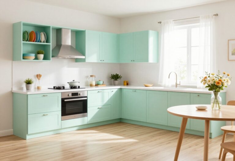
10. Mint Green and White
Mint green and white is one of those combos that feels both nostalgic and completely current. The pale green brings a soft energy to the kitchen without screaming for attention, while crisp white keeps everything feeling airy and open. Lower cabinets in mint green anchor the room with a gentle pop of color, and white uppers keep the visual weight light.
A classic subway tile backsplash in bright white ties it all together, adding texture without clutter.
Why It Works
The contrast between the colored lowers and white uppers creates a natural visual break that makes the kitchen feel larger and more organized. Mint green is lively enough to add character but cool enough to stay calming, so the space never feels busy or overwhelming.
Best For
This palette works especially well in galley kitchens or smaller spaces where you want a fresh, open feel without going all-white. It also suits homes with a retro-modern aesthetic or anyone who wants a hint of color that still feels clean and timeless.
Styling Tip
Stick with matte finishes for the mint cabinets to keep the look modern. Add warmth with natural wood cutting boards or a woven runner. Keep countertops minimal—just a few clear glass jars or a simple plant—so the green stays the star.
11. Slate Blue and Brushed Nickel
Slate blue cabinets paired with brushed nickel fixtures create a kitchen that feels both calming and crisp. The deep blue hides everyday smudges and spills surprisingly well, while the metallic hardware adds just enough shine to keep the space from feeling flat. This combination works especially well in kitchens with plenty of natural light, where the cool tones can really breathe.
Why It Works
The slate blue is dark enough to mask fingerprints and water spots, so your kitchen stays looking tidy longer. Brushed nickel offers a subtle gleam that doesn't compete for attention—it quietly elevates the whole look without adding visual clutter.
Best For
Open-plan kitchens where you want a unified, modern feel without going stark white or all-gray. It's also great for busy family kitchens where low-maintenance surfaces are a priority.
Styling Tip
Keep countertops light, like a warm white quartz or butcher block, to prevent the blue from feeling too heavy. Add open shelving in the same brushed nickel finish for a cohesive, streamlined look.
FAQ
What kitchen colour combination makes a small kitchen look bigger?
Light colours like pale blue, soft gray, or warm white paired with white cabinets or backsplash can make a small kitchen feel more open. Keeping the palette simple reduces visual clutter and helps the space feel airy.
How do I choose a colour combination that hides mess?
Darker shades like charcoal, navy, or olive green on lower cabinets are great at hiding smudges and crumbs. Pair them with lighter uppers or countertops to keep the room from feeling too dark.
Can I use bold colours without making the kitchen look cluttered?
Yes, if you limit bold colours to one area, like an island or an accent wall, and keep the rest neutral. This creates a focal point without overwhelming the space.
What is the best colour combination for a modern kitchen?
A combination of white and natural wood with black accents is a timeless modern choice. It's clean, warm, and easy to update with accessories.
How many colours should I use in a kitchen palette?
Stick to two main colours plus one accent (like hardware or decor). Too many colours can make the kitchen feel busy and harder to organize visually.
Conclusion
Choosing the right colour combination is one of the simplest ways to make your kitchen feel more organized and inviting. These 11 pairings prove that you don't need a full remodel to cut clutter—just a thoughtful palette that works with your lifestyle.
Whether you lean toward soft neutrals or deeper hues, each idea offers a fresh start without sacrificing style. Pick the one that speaks to you, and watch your kitchen transform into a calm, clutter-free haven.