13 Smart Kitchen Color Ideas For Walls That Make the Room Feel Pulled Together
Choosing the right wall color for a small kitchen can feel tricky. You want something that adds personality without making the space feel cramped or chaotic. The good news is that with a little strategy, you can pick a shade that pulls the whole room together and even makes it feel larger.
Small kitchens actually benefit from a focused color palette. When you limit the number of hues, the eye moves smoothly across the room, creating a sense of order and openness.
The key is to choose colors that work with your cabinets, countertops, and lighting. Here are 13 kitchen wall color ideas that are especially smart for compact spaces.
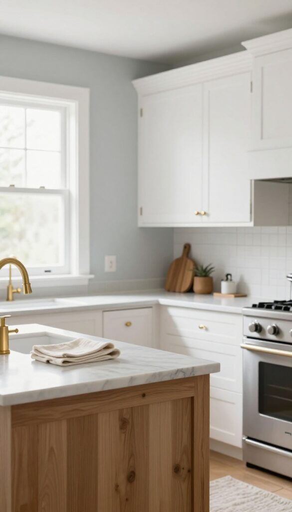
1. Soft White With Warm Undertones
A kitchen bathed in soft white feels instantly bigger and brighter—but not all whites are created equal. The trick is choosing one with warm undertones, like Swiss Coffee or Alabaster, so the space stays cozy rather than clinical. This shade bounces natural light around the room while playing nicely with wood tones, marble, and even bold cabinet colors, making it a go-to for small kitchens that need to feel open and pulled together.
Why It Works
Warm white walls reflect light without the starkness of pure white, creating an airy backdrop that visually expands the room. The subtle warmth also softens shadows and makes the kitchen feel inviting, not sterile.
Best For
Small kitchens, galley layouts, and any space that lacks abundant natural light. It's also ideal if you want a flexible neutral that adapts to changing decor styles.
Styling Tip
Pair warm white walls with natural wood open shelving and a matte black faucet for contrast. Add a few green plants or a woven runner to inject texture and keep the look from feeling flat.
2. Pale Sage Green for a Natural Touch
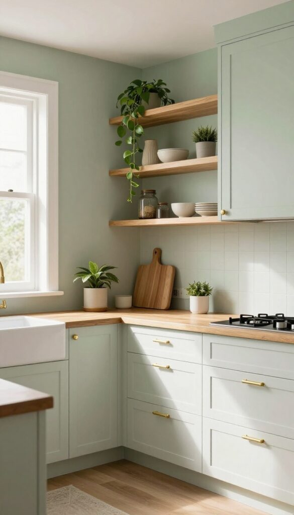
Sage green brings a gentle earthy vibe that feels fresh and calming. In a small kitchen, it adds a hint of color without overwhelming, and it works beautifully with white or wood cabinets. This soft green pairs well with natural materials like butcher block countertops and open shelving, creating a space that feels both grounded and airy.
Why It Works
Pale sage green is light enough to keep a small kitchen feeling open, but it has enough pigment to add warmth and personality. It reflects natural light softly, making the room feel brighter without being stark. Plus, it's a versatile neutral that complements a wide range of accent colors and finishes.
Best For
This shade is ideal for galley kitchens, L-shaped layouts, or any compact cooking space where you want a subtle connection to nature. It's also a great choice for kitchens with limited natural light, as it won't darken the room the way deeper greens might.
Styling Tip
Pair sage green walls with white shaker cabinets and brushed brass hardware for a fresh, timeless look. Add open wooden shelves and a few trailing plants to reinforce the natural theme. For a cohesive palette, bring in touches of cream, warm beige, and matte black in your accessories and textiles.
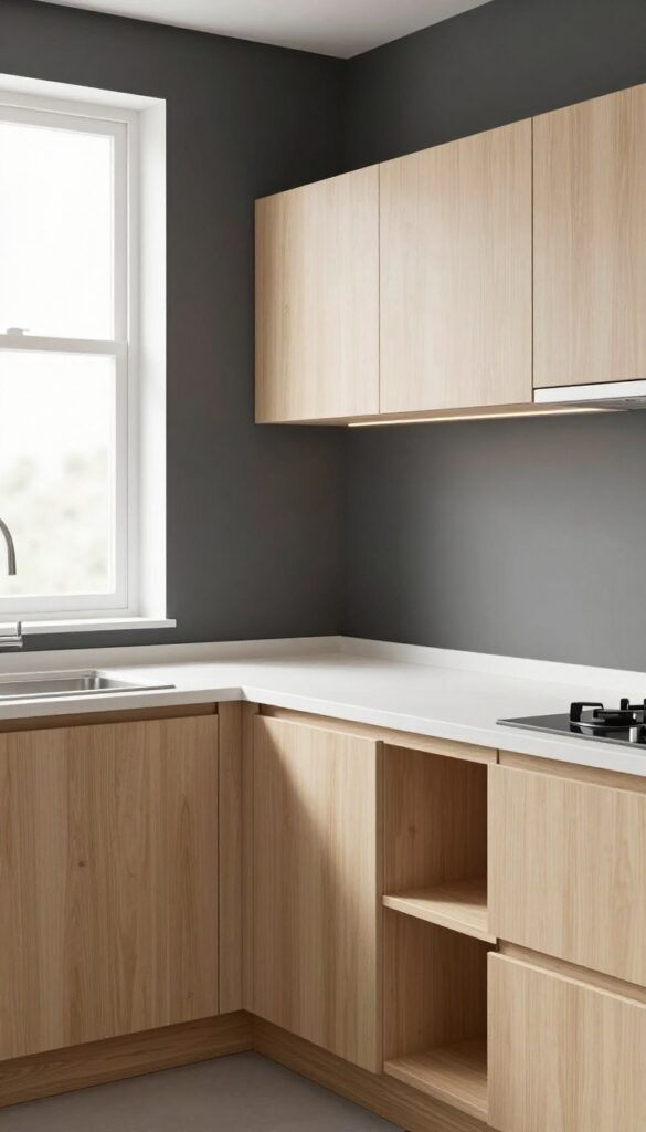
3. Light Gray-Blue for Airy Depth
Pale gray-blue brings a whisper of color that keeps the kitchen feeling open while adding a layer of quiet depth. Think of the softest sky on a hazy morning—muted, cool, and endlessly calming. On the walls, this hue reads almost neutral but carries enough personality to avoid feeling flat.
It’s a particularly smart choice for smaller kitchens because the cool undertone visually pushes walls back, making the room breathe a little easier.
Why It Works
The subtle blue-gray sits in a sweet spot between gray and pastel, reflecting light without glare. It complements stainless steel appliances and marble-look countertops by echoing their cool tones, creating a cohesive, polished look. Because it’s so soft, it won’t compete with cabinets or backsplashes, letting other elements shine while the walls quietly expand the space.
Best For
This color is perfect for galley kitchens, L-shaped layouts, or any kitchen where square footage is tight. It also works well in north-facing rooms that might feel dim, since the blue-gray doesn’t go muddy in lower light. If you love a clean, airy aesthetic but want more warmth than stark white, this is your go-to.
Styling Tip
Pair light gray-blue walls with warm wood accents—like open shelves or a butcher block island—to balance the coolness. Add brass or brushed gold hardware on cabinets and faucets for a subtle glow. Keep textiles (dish towels, rugs) in cream or soft white to maintain the breezy feel.
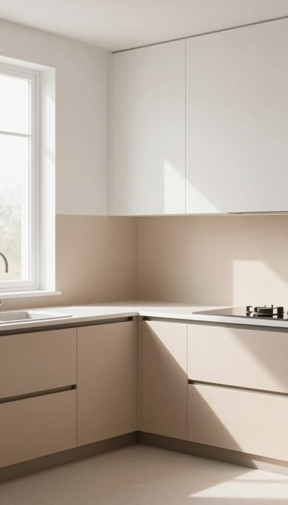
4. Warm Beige or Greige for Coziness
Neutrals don't have to feel flat or cold. A warm beige or greige—that perfect blend of gray and beige—brings a soft, grounded energy to a kitchen without tipping into yellow or stark white. It's the kind of color that makes a small space feel like a hug, wrapping the room in quiet warmth.
On a compact kitchen, this shade works like a neutral backdrop that lets your cabinets and countertops shine, while still adding depth and comfort.
Why It Works
Beige and greige absorb light gently, making a small kitchen feel cozy rather than cramped. Unlike pure white, which can feel sterile, or bold colors, which can overwhelm, this tone creates a seamless, calming foundation. It also hides minor smudges and crumbs better than lighter shades, which is a practical win for busy kitchens.
Best For
This color is ideal for small kitchens that get limited natural light, as it adds warmth without darkening the room. It also suits galley kitchens or open-plan layouts where you want the kitchen to feel like part of the living area, not a separate, cold space.
Styling Tip
Pair greige walls with white or off-white cabinets for a fresh contrast, then add natural wood open shelving or a butcher-block countertop for texture. A matte finish on the walls keeps the look soft and modern, while brushed brass or matte black hardware adds a subtle pop of personality.
5. Butter Yellow for a Cheerful Glow
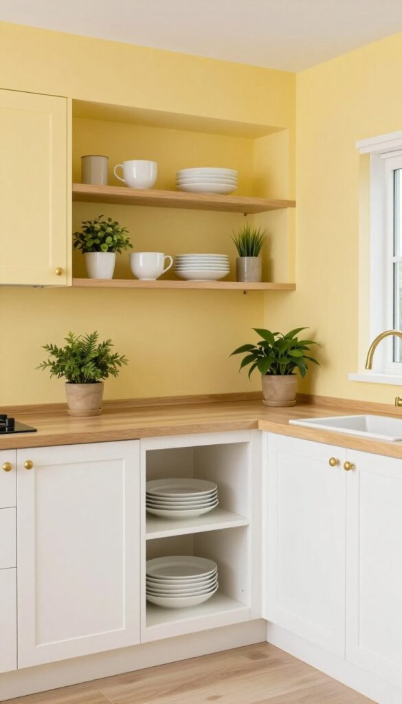
A muted butter yellow brings sunshine into a small kitchen without being too bright. It works especially well in north-facing rooms that need a little warmth. The soft, buttery tone feels like a gentle hug, making the space instantly more inviting.
Why It Works
Butter yellow reflects light beautifully, brightening up even the darkest corners. It’s cheerful without being overwhelming, and it pairs effortlessly with white trim, natural wood, and warm metals like brass or copper.
Best For
This color is ideal for small kitchens or galley layouts where you want to add a pop of color without closing in the room. It also works wonders in kitchens with limited natural light, especially those facing north.
Styling Tip
Keep the rest of the palette neutral to let the yellow shine. White cabinets, a light wood countertop, and open shelving with simple white dishes create a clean, airy look. Add a few green plants for a fresh contrast.
6. Dusty Rose or Blush for Subtle Romance
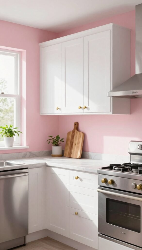
A whisper of dusty rose on the walls brings warmth without shouting for attention. This muted pink feels like a gentle hug for your kitchen, softening the edges of stainless steel and marble. It’s romantic but not overly sweet, making the space feel both intimate and grown-up.
In a small kitchen, blush reads as a neutral with personality—it bounces light around while adding a layer of depth that white alone can’t achieve.
Why It Works
Dusty rose sits between pink and brown on the color wheel, giving it a grounded, earthy quality that prevents it from feeling too girly. It plays beautifully with warm metals like brass or copper and contrasts nicely with crisp white cabinets, keeping the look balanced. Because it’s a softer hue, it doesn’t overwhelm a compact layout—instead, it makes the room feel cozier and more inviting.
Best For
This color is perfect for small kitchens that need a dose of warmth and personality without sacrificing openness. It’s also a great choice for galley kitchens or L-shaped layouts where you want the walls to feel like they’re wrapping around you. If your kitchen lacks natural light, dusty rose can actually help warm up the space and make it feel sunnier.
Styling Tip
Pair dusty rose walls with white upper cabinets and open shelving to keep the room airy. Add brass cabinet pulls, a warm wood cutting board, and a few trailing plants to enhance the romantic vibe. For a subtle contrast, use matte black fixtures or a concrete countertop to ground the pink and keep it from feeling too sweet.
7. Charcoal or Dark Navy for Drama
A dark accent wall in charcoal or deep navy can transform a small kitchen from forgettable to unforgettable. The richness of these hues adds depth and a sense of intimacy, making the space feel cozy rather than cramped. Paired with light cabinets and plenty of lighting, the room stays airy while gaining a sophisticated edge.
Why It Works
Dark colors absorb light, which can make a small room feel closer and more enveloping—exactly what you want for a cozy kitchen. The contrast with pale cabinetry and bright countertops keeps the space from feeling heavy, while the accent wall anchors the room and creates a natural focal point.
Best For
This idea works beautifully in small kitchens with good natural light or ample task lighting. It's especially effective in galley or L-shaped layouts where the dark wall sits opposite a window or light-colored backsplash, balancing the drama with brightness.
Styling Tip
Choose a matte finish for the accent wall to minimize glare and keep the look modern. Add open shelving in the same light wood as your cabinets to break up the dark expanse, and install under-cabinet LED strips to wash the countertop in warm light.
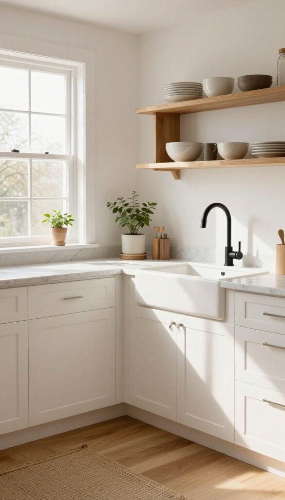
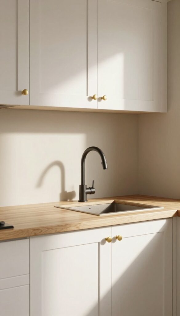
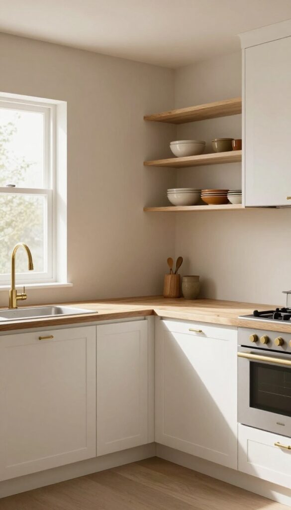
8. Creamy Off-White With a Hint of Gray
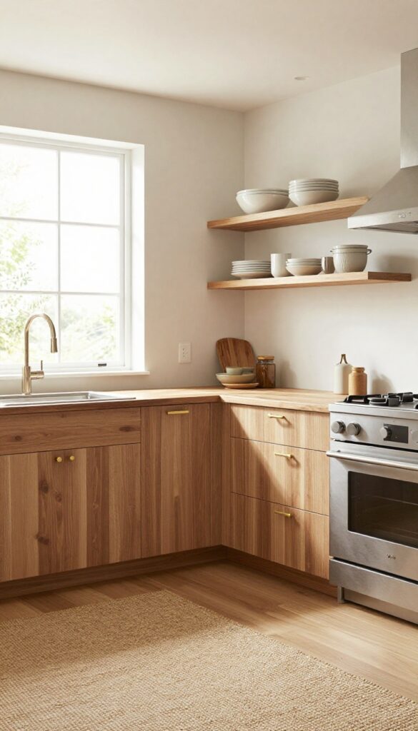
Sometimes the most pulled-together kitchens start with a wall color that doesn't shout. Creamy off-white with a whisper of gray does exactly that—it wraps the room in warmth without feeling heavy or too sweet. This is the kind of neutral that makes everything around it look better, from butcher-block counters to open shelving.
In a small kitchen, it keeps the space feeling open and airy while adding just enough depth to avoid that sterile, all-white look.
Why It Works
This shade sits in that sweet spot between warm and cool, so it pairs effortlessly with both wood tones and stainless steel. It reflects light beautifully, making a compact kitchen feel larger, yet it has enough pigment to hide minor smudges and daily wear better than pure white. The result is a calm, cohesive backdrop that lets your cabinets, backsplash, and decor take center stage.
Best For
Perfect for small kitchens, galley layouts, or any space where you want to maximize light without feeling cold. It's also a great choice if you love white kitchens but want something a bit softer and more forgiving.
Styling Tip
Layer in natural textures like a woven jute rug, warm brass hardware, and open shelving with ceramic dishes to add visual interest. A matte finish on the walls will keep the look modern and minimize glare from under-cabinet lighting.
9. Pale Terracotta for Warmth
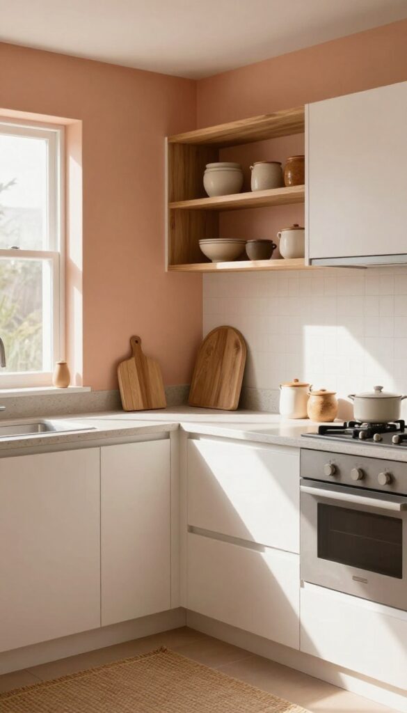
A whisper of terracotta on the walls brings a gentle, sunbaked warmth that makes even a compact kitchen feel welcoming. Unlike bold clay tones, this pale version stays soft and airy, so it won't overwhelm a small space. It pairs beautifully with natural wood shelves, warm white cabinets, and touches of rattan or linen for a look that feels both modern and grounded.
Why It Works
Pale terracotta adds subtle earthy color without darkening the room, keeping the kitchen bright and open. Its warm undertones create a cozy backdrop that makes stainless steel and marble feel less cold, while the slight Southwestern flair adds character without going theme-y.
Best For
This color shines in kitchens with limited square footage, especially those with good natural light. It's ideal if you have warm-toned wood cabinets or open shelving, and it works beautifully in galley kitchens or L-shaped layouts where you want a cohesive, inviting feel.
Styling Tip
Balance the warmth by using crisp white trim and a light countertop like quartz or butcher block. Add a few matte black or brass fixtures for contrast, and bring in texture with a woven runner or ceramic canisters to reinforce the earthy, grounded mood.
10. Mint Green for a Retro Vibe
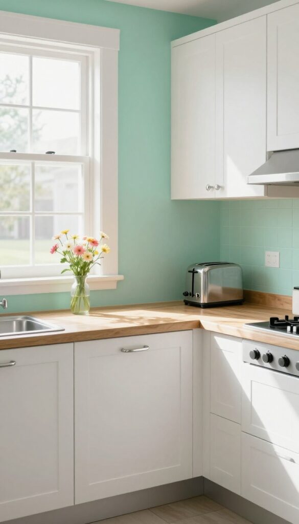
Mint green brings a playful yet soft energy to a kitchen, instantly evoking mid-century diners and vintage charm. This pastel shade feels fresh without being overpowering, making it a smart choice for small spaces where you want a pop of color without closing the room in. Paired with white cabinetry or chrome hardware, mint green walls create a clean, nostalgic look that feels both modern and timeless.
Why It Works
Mint green is light enough to reflect natural light, helping a compact kitchen feel airy and open. Its retro association adds character without requiring a full vintage renovation—just a coat of paint can shift the whole mood. The color also plays well with warm wood tones and brass accents, giving you flexibility to evolve the style over time.
Best For
This color shines in smaller kitchens or galley layouts where you want a cheerful, inviting atmosphere. It’s also ideal for rental kitchens that need a temporary, renter-friendly update—just paint the walls and swap in a few accessories. Mint green works beautifully in homes with natural light, but even north-facing rooms feel brighter with this hue.
Styling Tip
Balance mint green walls with plenty of white on cabinets, countertops, and open shelving to keep the look crisp. Add chrome or stainless steel hardware for a classic diner feel, or introduce warm brass for a more sophisticated twist. A few retro touches—like a pastel stand mixer or a patterned runner—reinforce the vibe without overwhelming the space.
11. Light Lavender for a Calming Effect
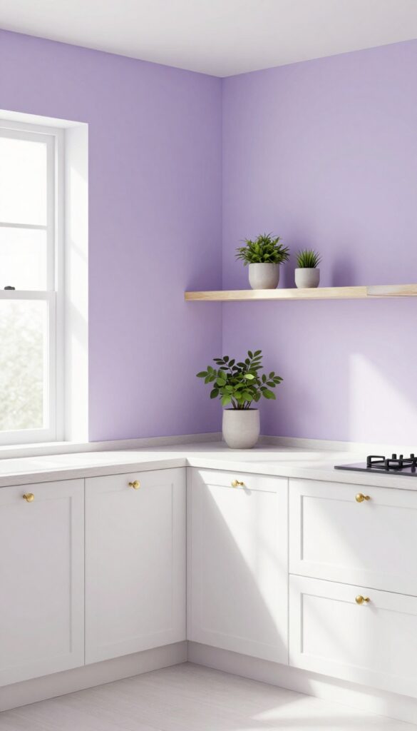
Lavender walls bring a serene, spa-like quality to a small kitchen. It's unexpected but not overpowering, and it complements white, gray, or even pale yellow cabinets. The soft purple hue adds warmth without making the space feel cramped, and it pairs beautifully with natural wood accents and plenty of greenery.
Why It Works
Light lavender is a cool tone that recedes visually, making a small kitchen feel more open and airy. Its calming effect reduces visual clutter and creates a peaceful cooking environment, which is especially welcome in tight quarters.
Best For
This color works wonders in galley kitchens or L-shaped layouts where you want to avoid a closed-in feeling. It also suits north-facing rooms that lack natural light, as lavender adds a gentle warmth without darkening the space.
Styling Tip
Balance the lavender with crisp white trim and open shelving to keep the look fresh. Add brass or matte black hardware for a touch of contrast, and incorporate plenty of plants to reinforce the natural, soothing vibe.
12. Taupe for a Neutral With Character
Taupe is that rare neutral that feels both warm and grounded without sliding into beige blandness. It sits somewhere between gray and brown, picking up the best qualities of both: the sophistication of gray and the coziness of brown. In a small kitchen, taupe walls create a soft backdrop that makes the space feel larger and more inviting, especially when paired with natural light or warm wood tones.
It's a color that doesn't shout but still gives your kitchen a distinct personality.
Why It Works
Taupe absorbs light gently, preventing the harsh contrasts that can make a small kitchen feel cramped. Its earthy undertones add depth and richness, so the room feels layered and intentional rather than flat. Because it's a neutral, it plays well with other colors and materials, letting you switch up accessories or cabinet hardware without repainting.
Best For
This shade is ideal for galley kitchens, L-shaped layouts, or any small space where you want to avoid stark white or cold gray. It also works beautifully in kitchens that get moderate natural light, as it won't wash out or feel too heavy.
Styling Tip
Pair taupe walls with white or light wood cabinetry for contrast, and add brass or matte black hardware for a subtle pop. A butcher-block countertop or open shelving with warm-toned dishes will reinforce the earthy vibe without overwhelming the room.
13. Two-Tone Walls for Visual Interest
Painting the upper half of your kitchen walls a lighter color and the lower half a slightly darker shade is a clever trick that instantly makes a small space feel taller and more dynamic. The subtle contrast adds depth without overwhelming the room, creating a look that's both polished and playful. It's an easy way to introduce color without committing to a full-on bold wall.
Why It Works
By dividing the wall horizontally, your eye is drawn upward, which gives the illusion of higher ceilings. The lighter top keeps the space airy, while the darker bottom grounds the room and adds a sense of stability. This technique also helps break up large expanses of wall, making the kitchen feel more intimate and layered.
Best For
This idea is ideal for small kitchens where you want to add personality without making the space feel cramped. It works especially well in galley kitchens or L-shaped layouts where wall space is limited but visual impact is still important. The subtle contrast keeps the look sophisticated and versatile.
Styling Tip
Keep the contrast subtle—choose a shade that's just two or three steps darker on the same color strip. For a clean, modern feel, pair a soft white or pale gray on top with a warm taupe or sage green on the bottom. Finish with a simple chair rail or leave the transition line crisp for a more contemporary edge.
FAQ
What is the best wall color for a small kitchen with no natural light?
Stick with warm whites, pale creams, or light greiges. These colors reflect whatever light is available and keep the space from feeling dark or cramped.
Should I paint my small kitchen walls the same color as my cabinets?
Not necessarily. If you want a monochromatic look, choose a slightly different shade for the walls to create depth. For example, white cabinets with a warm off-white wall.
Can I use dark colors in a small kitchen?
Yes, but use them sparingly. A dark accent wall or lower cabinets can add drama without overwhelming the space. Balance with light countertops and plenty of lighting.
What color makes a small kitchen look bigger?
Light, cool colors like soft blues, pale grays, and whites tend to make a room feel more open. They reflect light and create an airy atmosphere.
How do I choose a wall color that goes with my existing countertops?
Look at the undertones in your countertops. If they have warm undertones, choose warm wall colors like beige or cream. For cool undertones, go with grays or blues.
Conclusion
Finding the right wall color for a small kitchen is all about balance. You want a shade that adds personality without making the space feel crowded. Whether you go with a soft neutral or a subtle pastel, the goal is to create a cohesive backdrop that ties the room together.
Remember to test paint samples on your walls and observe them in different lighting throughout the day. With a little patience, you'll find the perfect color that makes your small kitchen feel pulled together and truly yours.