10 Warm Kitchen Color Ideas That Make the Room Feel Cohesive and Lived-In
A kitchen should feel like the heart of the home—not a sterile showroom. The right color palette can turn a cold, disconnected space into one that feels warm, welcoming, and effortlessly cohesive.
Whether you're planning a full remodel or just refreshing the walls, these ideas lean into lived-in charm without sacrificing style.
Let's explore ten color directions that bring warmth and harmony to your kitchen.
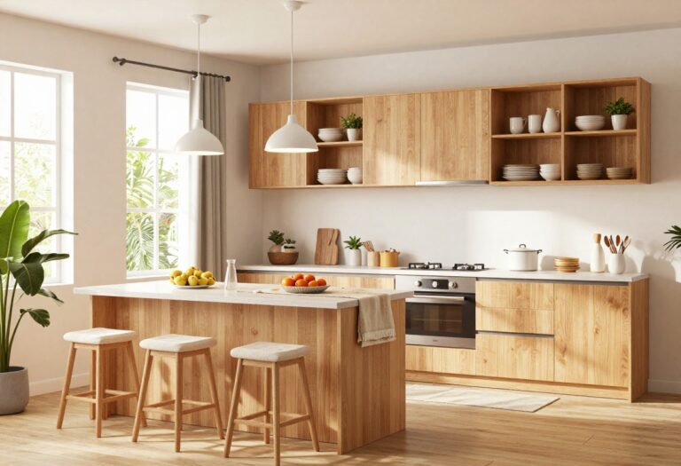
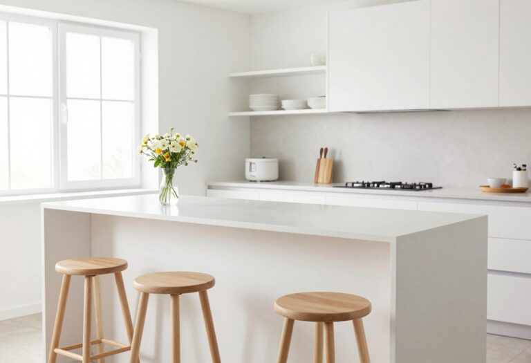
1. Creamy White with Warm Wood Accents
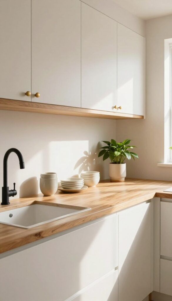
Soft white cabinets instantly open up a kitchen, but they can feel a little sterile without something to ground them. That's where warm wood comes in. By pairing creamy off-white cabinetry with natural wood open shelving or a butcher block countertop, you get a space that feels bright yet cozy, clean but far from cold.
It's the kind of look that makes a kitchen feel like the heart of the home rather than a showroom.
Why It Works
The cream base reflects light beautifully, making even smaller kitchens feel airy and spacious. Wood adds organic texture and warmth, creating visual contrast without jarring colors. Together, they strike a balance that feels both timeless and inviting.
Best For
This combination is perfect for farmhouse-style kitchens, rustic cottages, or any home where you want a welcoming, lived-in vibe. It also works well in open-concept spaces where the kitchen needs to blend seamlessly with warm-toned living areas.
Styling Tip
To keep the look from feeling too matchy-matchy, choose wood with visible grain and variation—like oak or walnut. Add a few matte black or brass fixtures for subtle contrast, and layer in soft textiles like a linen runner or woven baskets for extra warmth.
2. Sage Green Cabinets with Brass Hardware
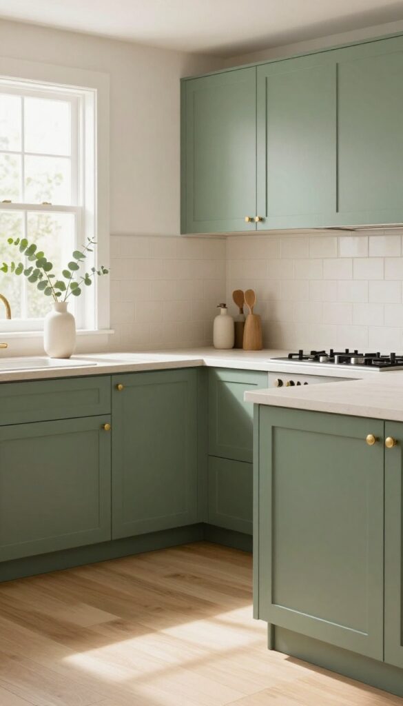
There's a reason sage green has become such a staple in kitchen design—it’s soft enough to feel neutral but has enough personality to keep a space from feeling flat. When you pair it with warm brass hardware, the whole look takes on an inviting, slightly vintage charm that feels both current and timeless. It’s the kind of color that makes you want to linger over morning coffee or cook a slow weekend dinner.
Why It Works
Sage green sits in that sweet spot between cool and warm, so it works with a wide range of countertop materials and backsplash tiles. The brass hardware adds just enough contrast to make the cabinets pop without overwhelming the eye. Together, they create a balanced palette that feels grounded and soothing—perfect for a kitchen where you want to unwind.
Best For
This combination is ideal for kitchens that get plenty of natural light, because the sage can read a bit darker in dim spaces. It’s especially lovely in open-concept homes where the kitchen flows into a living or dining area, since the earthy tone helps connect the rooms visually. If you have white or light wood floors, even better—the contrast will make the cabinets stand out beautifully.
Styling Tip
To keep the look from feeling too heavy, choose unlacquered brass hardware that will develop a natural patina over time. That subtle aging adds character and keeps the kitchen from looking too polished or staged. Pair with warm white walls and a simple subway tile backsplash in a cream tone to let the cabinets be the star.
3. Terracotta Accent Wall with Neutral Cabinets
There's something about terracotta that instantly makes a kitchen feel grounded and welcoming. It's not a loud color, but it has presence—like a warm sunset captured on your wall. By limiting it to one accent wall behind the stove or sink, you get all that cozy energy without the room feeling like a terra-cotta pot.
Pair it with soft beige or warm gray cabinets, and the whole space breathes easy.
Why It Works
Terracotta brings earthy warmth that plays beautifully with neutral cabinetry, creating a balanced backdrop that feels both trendy and timeless. The contrast keeps the kitchen from looking flat, while the single wall keeps the look intentional and not overwhelming.
Best For
This idea shines in kitchens that get good natural light, as the terracotta will glow without darkening the room. It's also perfect for open-concept homes where you want to define the kitchen area without closing it off.
Styling Tip
Stick with matte-finish paint for a more organic look. Add open shelving in the same neutral tone as your cabinets, and style them with cream ceramics and dried eucalyptus to reinforce the earthy vibe.
4. Warm Beige on Walls and Island Contrast
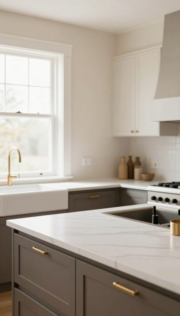
Beige has a way of making a kitchen feel instantly grounded without fading into the background. When you pair a soft, warm beige on the perimeter walls with a deeper taupe or charcoal island, the room gains structure and depth. It’s a combination that feels both intentional and effortless, like the space has always been that way.
Why It Works
The contrast between the lighter walls and darker island creates natural visual anchors in the room. Your eye moves from the airy perimeter to the grounded center, which makes the kitchen feel larger while still cozy. The warm undertones in both colors keep everything connected instead of feeling choppy.
Best For
This palette is ideal for open-concept kitchens where you want the cooking zone to feel distinct without closing it off. It also works beautifully in kitchens with lots of natural light, as the beige stays soft and inviting rather than looking flat or dull.
Styling Tip
Bring in brass or matte black hardware on cabinets and faucets to add a subtle metallic pop against the beige. On the island, try a butcher-block countertop or a warm wood cutting board to echo the earthy vibe. Keep countertops relatively clear so the color contrast remains the star.
5. Dusty Blue Lower Cabinets with White Uppers
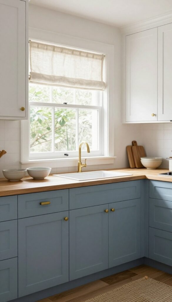
There’s something quietly confident about a kitchen that doesn’t try too hard. Dusty blue on the lower cabinets brings a soft, grounded feel, while white uppers keep the room from feeling heavy. It’s a combination that feels both fresh and settled—like it’s been there all along.
Natural linen textiles and ceramic accents add just enough texture to make the space feel lived-in, not staged.
Why It Works
The two-tone cabinet approach breaks up visual mass and makes the kitchen feel larger. Dusty blue has a calming, earthy quality that pairs well with warm wood tones and natural materials, while white reflects light and keeps things airy.
Best For
This idea is ideal for kitchens that get good natural light but want to avoid an all-white look. It also works beautifully in open-concept homes where you want the kitchen to feel connected to adjacent living spaces without shouting for attention.
Styling Tip
Swap out hardware for unlacquered brass or matte black knobs to add a subtle contrast. Keep countertops relatively clear—let the cabinet color be the star—and layer in a woven runner or linen curtains for softness.
6. Butter Yellow Backsplash with White Cabinets
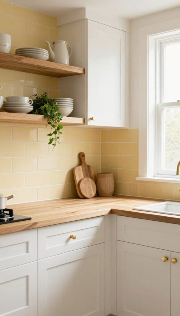
A kitchen should feel like the heart of the home, and nothing says warm and lived-in quite like a buttery yellow backsplash. This shade is soft enough to be subtle yet cheerful enough to add a daily dose of sunshine. Paired with crisp white cabinets, it strikes that perfect balance between cozy and clean—a combination that makes you want to linger over morning coffee or gather around the counter for an evening chat.
Why It Works
Yellow naturally lifts the mood, and when used as a backsplash, it adds warmth without overwhelming the space. White cabinets keep everything feeling fresh and airy, while the butter tone brings in just enough color to make the kitchen feel personal and inviting. The contrast is gentle but effective, creating a backdrop that feels both timeless and happy.
Best For
This idea shines in kitchens that get good natural light, especially those with north- or east-facing windows where the yellow can warm up cooler daylight. It's also a fantastic choice for open-concept homes where you want the kitchen to feel connected to living areas without screaming for attention. If you love a cottage or farmhouse vibe but want something a little more playful, this is your match.
Styling Tip
To keep the look grounded, add open shelving in warm wood tones—like oak or walnut—above the backsplash. This introduces texture and prevents the space from feeling too sterile. Finish with brass or unlacquered brass hardware on cabinets for a touch of warmth that echoes the yellow.
7. Olive Green Walls with Cream Trim
Olive green has a way of making a kitchen feel like a cozy retreat. It's not as bold as emerald or as muted as sage, but sits right in that sweet spot of earthy and sophisticated. When paired with cream trim and light countertops, the green feels grounded without overwhelming the space.
The cream acts like a soft frame, keeping everything bright and breathable even in smaller kitchens. It's one of those color combinations that looks intentional and collected, not like you just picked a shade out of habit.
Why It Works
Olive green absorbs light in a way that creates depth, which makes walls feel like they're wrapping around you—perfect for making a compact kitchen feel intimate rather than cramped. The warm undertones in olive also play nicely with natural materials like wood and stone, so your countertops and cabinets won't fight for attention. Cream trim adds just enough contrast to define the room's shape without introducing harsh lines.
Best For
This palette shines in kitchens that get moderate to good natural light, especially those with south- or west-facing windows. It's ideal for galley kitchens, small eat-in kitchens, or any space where you want to dial up the warmth without going full dark moody. If your cabinets are white or light wood, the transition will feel seamless.
Styling Tip
Bring in brass or unlacquered brass hardware on cabinets and drawer pulls—the warm metal pops beautifully against olive green. For countertops, go with a white marble look or a warm quartzite to keep things light. Add open shelving in cream or natural oak to break up the wall color and display a few ceramic pieces or cookbooks.
8. Blush Pink Accents with Warm Gray Cabinets
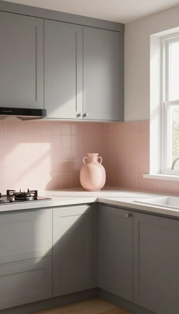
Warm gray cabinets already bring a cozy, grounded feel to a kitchen, but adding blush pink accents takes them from neutral to noteworthy. Think of it as a soft whisper of color rather than a shout—a few blush textiles, a small backsplash tile, or even just a ceramic vase on the counter. The result is a space that feels both mature and playful, without trying too hard.
Why It Works
Blush pink and warm gray are natural companions—the pink adds warmth and softness while the gray keeps things grounded. Because the pink is used sparingly, it never overwhelms the room or feels overly feminine. Instead, it creates a subtle contrast that makes the kitchen feel intentional and curated.
Best For
This combination is ideal for kitchens that want to feel calm but not cold. It works especially well in open-plan spaces where you want the kitchen to blend with adjoining living areas without disappearing into beige or all-white monotony.
Styling Tip
Start with one or two blush elements—like tea towels, a rug, or bar stools—and see how they interact with your gray cabinets before committing to more. For a bolder move, consider a blush pink tile backsplash behind the stove; it becomes a focal point without screaming for attention.
9. Rich Navy Island with White Perimeter
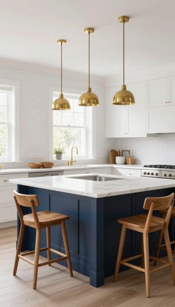
Navy blue is having a serious moment in kitchens, and for good reason. It brings depth and personality without feeling cold or overly trendy. When you pair a deep navy island with crisp white perimeter cabinets, you get a balanced look that feels both grounded and airy.
The contrast is striking but not harsh, especially when you soften it with warm brass fixtures and natural wood accents. This combo works beautifully in open-concept homes where the kitchen flows into living spaces, because the navy anchors the room while the white keeps things light.
Why It Works
The dark island acts as a visual anchor, drawing the eye and creating a natural focal point. White cabinets on the surrounding walls reflect light, so the room stays bright even with a bold color on the island. The navy also hides everyday wear and tear better than lighter shades, making it practical for busy families.
Best For
This idea is ideal for medium to large kitchens with good natural light. It's especially effective in open layouts where you want to define the kitchen zone without closing it off from adjacent rooms. If you have a kitchen with a separate island that sees heavy use—prepping, eating, homework—navy is a forgiving choice.
Styling Tip
Balance the cool tones of navy by adding warm metal finishes like brass or unlacquered brass for cabinet hardware and lighting. Wood bar stools with a natural or honey finish introduce warmth at seating height. For countertops, consider a warm white marble or quartz with subtle veining to tie the two colors together.
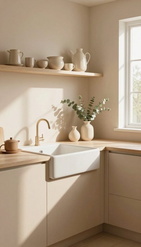
10. Warm Taupe on Everything with Layered Textures
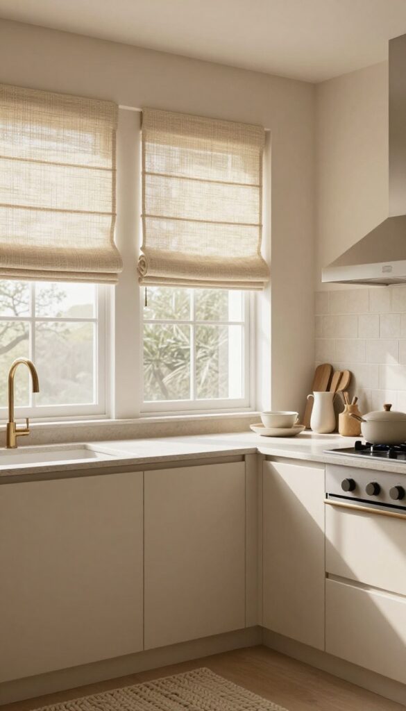
Imagine walking into a kitchen that feels like a warm hug—no stark whites, no cold grays. That’s the magic of coating everything in a single warm taupe. By using the same hue on cabinets and walls, you erase visual breaks and let the room breathe.
The trick to keeping it from feeling flat? Pile on texture: matte cabinet fronts, a woven Roman shade, honed stone countertops, and maybe a chunky knit runner. Suddenly, that one color becomes a backdrop for depth and coziness.
Why It Works
A monochromatic scheme eliminates color clashes and makes a small kitchen feel larger. Taupe’s earthy undertone adds warmth without overwhelming, so the space stays inviting. Texture becomes the star—your eye moves from smooth stone to rough weave to soft matte, creating interest without adding clutter.
Best For
This idea shines in kitchens with lots of natural light, where taupe can shift from caramel to mushroom throughout the day. It’s also perfect for open-plan homes because the neutral palette flows easily into adjoining living areas.
Styling Tip
Choose at least three distinct textures: one for cabinets (matte lacquer), one for counters (honed quartzite or soapstone), and one for window treatments (bamboo or linen). Add a fourth with accessories like ceramic canisters or a wood cutting board leaning against the backsplash.
FAQ
What are the best warm colors for a small kitchen?
Soft creams, pale sage, and warm beige work well in small kitchens because they reflect light while adding warmth. Avoid very dark colors unless balanced with ample lighting.
How do I make my kitchen feel more lived-in without clutter?
Focus on texture and natural materials—wood cutting boards, linen towels, ceramic canisters. These add warmth and personality without visual chaos.
Can I mix warm and cool colors in a kitchen?
Yes, but use warm tones as the base and cool tones sparingly as accents. For example, warm beige walls with cool blue accessories can work if the blue is muted.
What finish is best for warm kitchen cabinets?
Satin or matte finishes enhance warmth by reducing glare. Glossy finishes can feel more modern and less cozy, so stick with low-sheen for a lived-in look.
How do I choose a warm color that won't feel dated?
Stick with nature-inspired hues like sage, terracotta, or warm taupe. These have longevity because they mimic organic materials and avoid trendy extremes.
Conclusion
Choosing a warm kitchen color palette isn't just about aesthetics—it's about creating a space that feels like home. Whether you go for a soft sage or a rich navy, the key is layering in textures and personal touches that make the room yours.
Start with one idea that speaks to you, and build from there. Your kitchen will thank you.