11 Charming Kitchen Color Combinations Ideas That Cut Clutter Fast
A kitchen that feels calm and put-together isn't just about clever storage—it's also about the colors you choose. The right palette can trick the eye into seeing less mess, making the whole room feel more spacious and serene.
Think of color as your secret weapon against clutter: it sets the mood, defines zones, and creates a visual flow that keeps everything looking intentional. When you pair soft, muted tones with strategic pops of contrast, your countertops and shelves instantly appear more organized.
Layering in warm neutrals, gentle greens, or creamy whites adds depth without overwhelming the senses. These combinations work because they embrace a cozy, relaxed vibe while subtly guiding the eye away from chaos.
1. Sage Green and Warm White
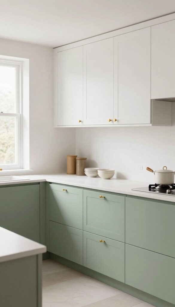
Soft sage green on lower cabinets grounds a kitchen with earthy calm, while warm white uppers keep the space feeling open and breezy. It’s a color duo that feels both fresh and lived-in—like a cozy cottage that happens to be incredibly organized. Open shelving in the same warm white lets you display a few everyday dishes, and the green backdrop instantly makes those shelves look intentional rather than stuffed.
Why It Works
The two-tone cabinet strategy visually breaks up the room, making it feel larger and more structured. Darker lower cabinets hide dirt and wear better, while light uppers reflect natural light. The result is a kitchen that feels orderly without being stark.
Best For
This combination is ideal for medium-sized kitchens with good natural light. It works especially well in homes that want a hint of nature indoors without going full farmhouse.
Styling Tip
Stick to matte finishes for both colors—they soften the contrast and add to the cozy vibe. Use brass or black hardware to give the green cabinets a subtle pop.
2. Creamy Beige and Matte Black
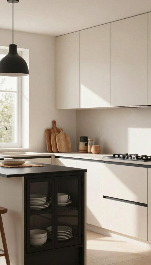
There’s something quietly confident about a kitchen that pairs warm, creamy beige with sharp matte black accents. The beige keeps the space soft and inviting, while the black adds just enough edge to keep things interesting. It’s a combination that feels both timeless and modern, without trying too hard.
Why It Works
The contrast between the light, warm beige and the dark, matte black creates visual structure without adding clutter. Black hardware and light fixtures act like anchors, giving the eye a place to rest. The black-framed glass cabinet fronts break up the beige expanse and cleverly hide mismatched dish stacks.
Best For
This palette is ideal for kitchens that get plenty of natural light, where the beige can glow without feeling flat. It also works well in open-plan spaces where you want the kitchen to feel connected to adjoining rooms but still have its own identity.
Styling Tip
Stick with matte finishes for the black elements—think brushed nickel or powder-coated metal—to keep the look soft and modern. Add warmth with natural wood cutting boards or a woven runner. Avoid glossy black; it can feel too harsh against the creamy backdrop.
3. Dusty Blue and Natural Wood
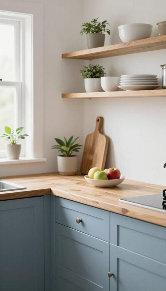
There’s something quietly soothing about dusty blue—it’s soft without being pastel, cool without feeling cold. When you pair it with natural wood, the combination instantly feels grounded and lived-in. The wood adds warmth and texture, while the blue brings a calm focus to the space.
It’s a color duo that makes your kitchen feel intentional without trying too hard.
Why It Works
Dusty blue pulls your eye to surfaces you want to highlight, like an island or an accent wall, while natural wood provides warmth that keeps the look from feeling sterile. Together, they create a visual anchor that reduces visual noise—your eye rests on the color and texture instead of scattered countertop clutter.
Best For
This pairing is ideal for kitchens with good natural light, where the dusty blue can shift from muted to vibrant throughout the day. It also works well in open-concept spaces because the wood tones tie into adjacent living areas.
Styling Tip
Keep countertops mostly clear to let the color shine. Add a few wooden cutting boards or a simple fruit bowl on the counter for extra warmth. Open shelving in natural wood is a great way to echo the look without overwhelming the space.
4. Pale Yellow and Soft Gray
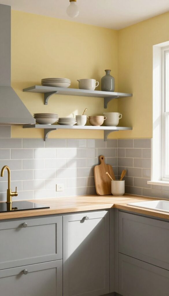
There’s a reason pale yellow and soft gray keep showing up in cozy kitchens. The yellow adds a gentle, sunlit warmth that makes the space feel cheerful without screaming for attention. Paired with gray’s calming neutrality, the combo creates a balanced backdrop that feels both airy and grounded—perfect for small kitchens that need to feel bigger and brighter.
Why It Works
The contrast between warm yellow and cool gray keeps the eye moving, which tricks the brain into seeing more space. Yellow on upper walls or backsplash draws light upward, while gray on lower cabinets anchors the room. This balance prevents visual clutter because each color has a clear job: one lifts, one settles.
Best For
This pairing is ideal for galley kitchens or L-shaped layouts where you want to avoid a cramped feel. It also works wonders in north-facing kitchens that lack natural light—the yellow mimics sunshine without overwhelming the room.
Styling Tip
Use matte finishes to keep the look soft and lived-in. Add open shelves in gray with a few ceramic dishes or wooden cutting boards—the yellow behind them will make everyday items blend in rather than scream for attention. A warm brass faucet or pendant light ties both colors together nicely.
5. Terracotta and Off-White
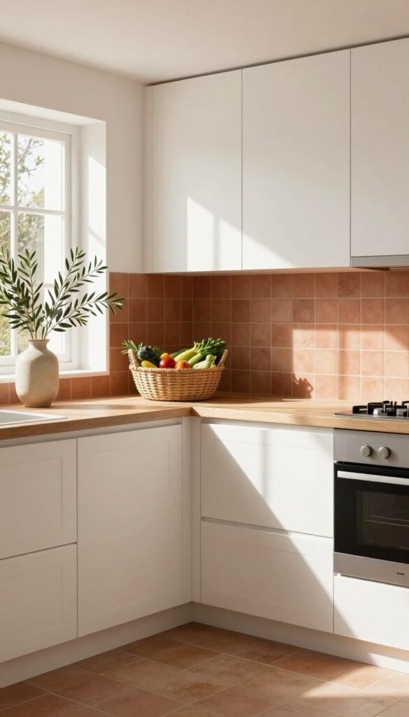
Warm terracotta tones paired with crisp off-white create a kitchen that feels both grounded and airy. The earthy richness of terracotta—whether on tile, an accent wall, or backsplash—brings a cozy, sunbaked feel that makes the space instantly inviting. Off-white cabinets balance the warmth, keeping the room from feeling too heavy or dark.
It’s a combination that looks effortlessly layered, like a well-loved Spanish villa meets modern practicality.
Why It Works
- Terracotta is surprisingly forgiving when it comes to daily messes. Its natural variation in color hides crumbs, smudges, and splatters far better than stark white or glossy surfaces. The off-white cabinets reflect light, so the kitchen stays bright even with darker accents.
- Together, they strike a perfect balance between cozy and clean—no constant wiping required.
Best For
This palette works beautifully in kitchens that get lots of natural light, where the terracotta can glow without feeling muddy. It’s also ideal for open-concept spaces where you want the kitchen to feel warm but not visually separate from the living area. Renters can try it with peel-and-stick terracotta tiles or a removable backsplash film.
Styling Tip
Add woven baskets in similar earthy hues—think rattan, seagrass, or jute—to store produce, linens, or pantry items. They blend right into the color scheme while adding texture. A few olive branches in a ceramic vase on the countertop reinforce the organic feel without cluttering the space.
6. Navy Blue and Brass
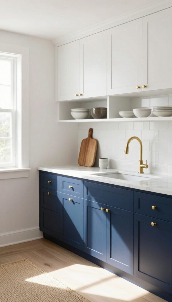
There’s something about navy blue that feels both grounded and elegant, especially when you pair it with the warm glow of brass. In a kitchen, navy lower cabinets act like a visual anchor—they hide everyday messes and create a sense of depth without overwhelming the space. Brass handles or a gooseneck faucet catch the light and add just enough sparkle to keep things from feeling flat.
White uppers or open shelving balance the darkness, so the room stays airy and open.
Why It Works
Dark colors like navy are masters at camouflaging fingerprints, smudges, and general kitchen chaos. The brass elements reflect light around the room, making the space feel brighter without adding actual clutter. This combo gives you a sophisticated look that’s surprisingly low-maintenance.
Best For
This color scheme shines in kitchens that get good natural light, especially those with white countertops or backsplashes. It’s also a great pick if you want a moody, cozy vibe but still need a practical, family-friendly workspace.
Styling Tip
Stick to unlacquered brass for a lived-in patina that softens over time—it adds character without trying too hard. Add a woven runner or wooden cutting boards to introduce texture and keep the navy-and-brass combo from feeling too formal.
7. Blush Pink and Charcoal
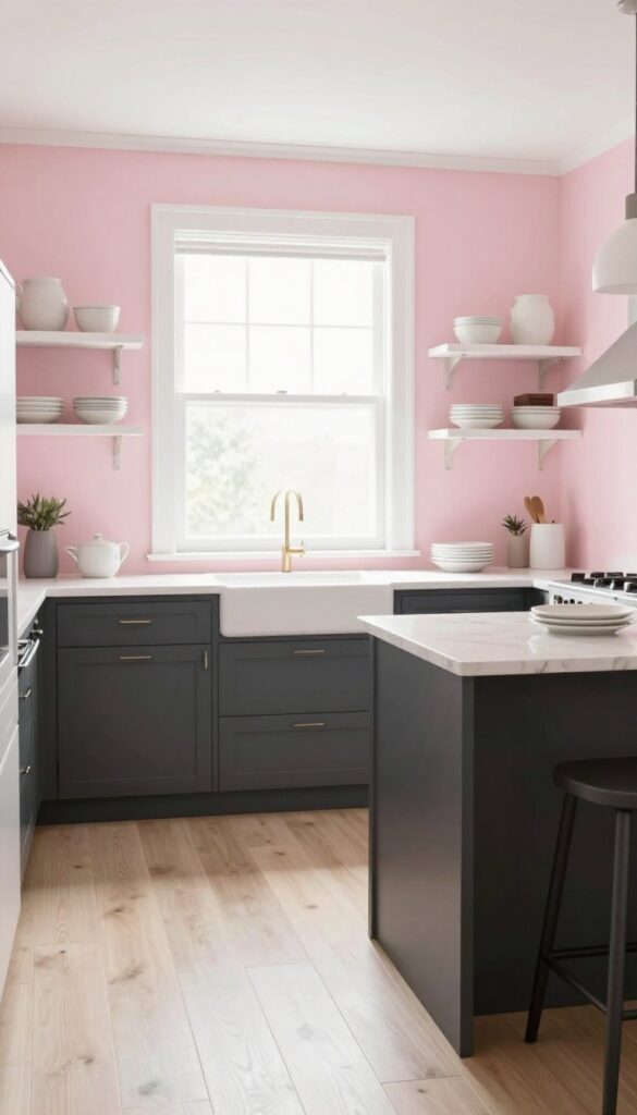
There’s something unexpectedly calming about pairing a soft blush pink with deep charcoal gray. The pink brings a gentle warmth that keeps the kitchen from feeling too serious, while the charcoal grounds everything with a solid, modern anchor. It’s a combination that feels both fresh and lived-in—like a cozy café you never want to leave.
Why It Works
Blush pink has a way of softening hard edges and making a space feel inviting, while charcoal gray adds visual weight and sophistication. Together, they create balance: the pink lifts the mood, and the charcoal prevents it from feeling too sweet or girly. It’s a duo that feels intentional without trying too hard.
Best For
This color combo is ideal for kitchens that get plenty of natural light, since the pink can read as muted rather than washed out. It works especially well in open-concept homes where you want the kitchen to feel connected to living areas without blending in completely.
Styling Tip
Use blush pink on an accent wall or backsplash, then bring in charcoal on the island or lower cabinets. Tie it together with charcoal bar stools or a textured rug—the dark tones will make the pink pop without overwhelming the space.
8. Olive Green and Cream
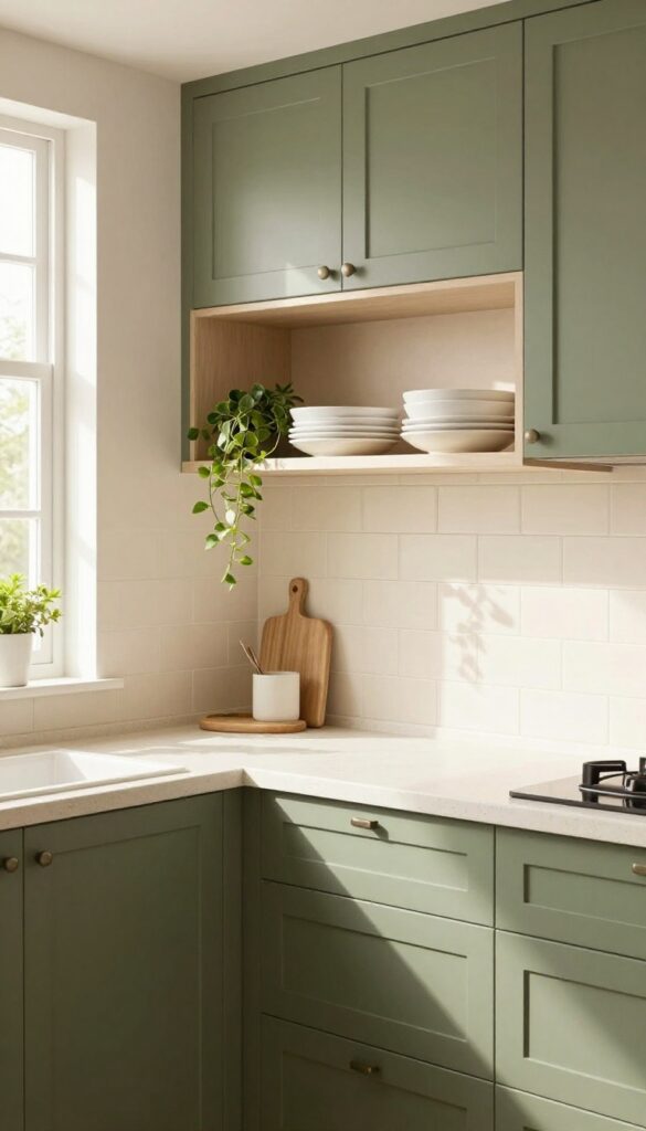
This combo brings the outdoors in without going full jungle. Olive green on your cabinets or walls creates a grounded, earthy backdrop that feels warm and inviting. Cream countertops and backsplash keep things airy, so the space never feels heavy or dark.
Why It Works
The muted green hides smudges and crumbs way better than white or light gray. You get a clean-looking kitchen with way less wiping. The cream adds just enough brightness to keep the room from feeling cave-like.
Best For
Kitchens that get a lot of daily use—especially if you have kids or cook often. It's also great for spaces with limited natural light, since the cream bounces light around while olive green adds depth.
Styling Tip
Add cream-colored open shelving to tie the palette together. Use them to display white dishes, wooden cutting boards, and a few trailing plants for a relaxed, layered look.
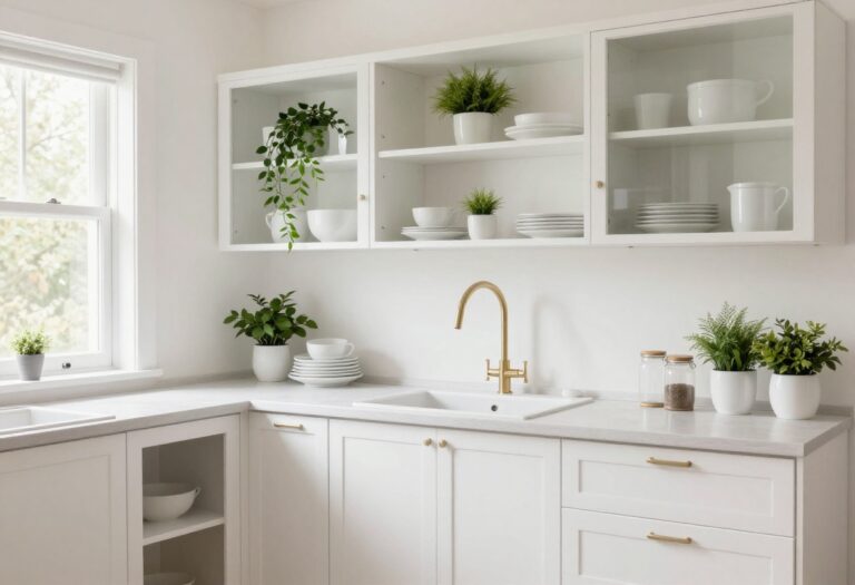
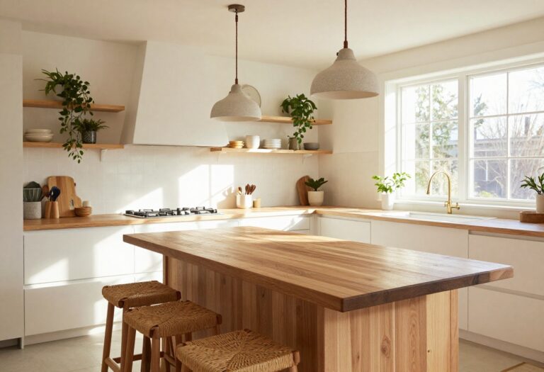
9. White and Light Wood with Black Accents
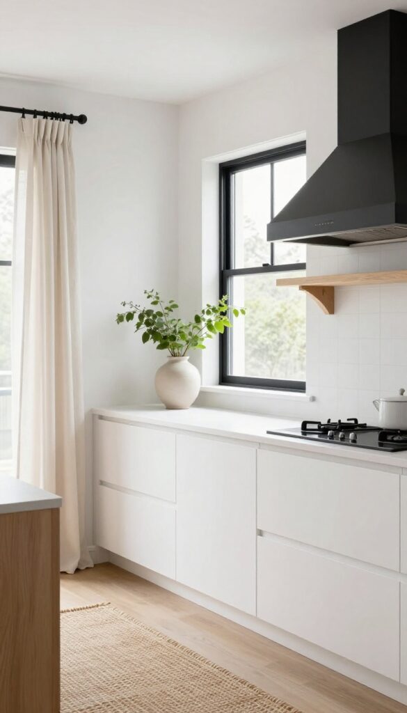
This combination walks the line between crisp and cozy better than almost any other palette. White cabinets and light wood floating shelves keep the kitchen feeling open and airy, while black window frames or a matte black range hood add just enough weight to ground the space. The wood brings in warmth and texture, so the white never feels cold or clinical—it feels intentional, fresh, and welcoming.
Why It Works
The contrast is what makes this scheme so effective. White reflects light and makes a small kitchen feel larger, light wood adds natural warmth without darkening the room, and black accents create visual anchors that prevent the space from looking washed out. It's a balanced trio that reads as both modern and timeless.
Best For
This look is ideal for kitchens that get good natural light but could use a bit more depth. It's especially great for galley kitchens or L-shaped layouts where you want to avoid a cramped feeling. If you love Scandinavian or Japandi style but want something a little more layered, this is your sweet spot.
Styling Tip
Keep the black accents intentional but sparse—a black faucet, cabinet pulls, and a single pendant light are enough. Add texture with open shelving: stack white dinner plates, a wooden cutting board, and a few ceramic jars. A woven runner or linen curtains soften the look even further.
10. Lavender and Warm Gray
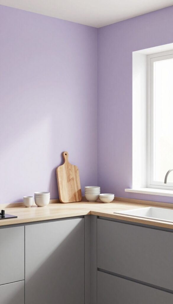
Lavender might sound like a bold choice for a kitchen, but when paired with warm gray, it becomes surprisingly grounded. The soft purple reads as a neutral—calming, slightly romantic, and never garish. On an accent wall or backsplash, it adds just enough personality without screaming for attention.
Warm gray cabinets or countertops keep everything balanced, so the space feels cozy rather than cold.
Why It Works
Lavender has a naturally soothing effect, which is perfect for a room where you start and end your day. Warm gray acts as an anchor, preventing the lavender from feeling too airy or feminine. Together, they create a layered, lived-in look that feels both fresh and timeless.
Best For
This combo is ideal for kitchens that get plenty of natural light—the lavender stays soft and subtle rather than overwhelming. It also works well in open-concept layouts where you want a hint of color without clashing with adjacent rooms.
Styling Tip
Stick to matte finishes for both the lavender wall and warm gray cabinetry to keep the look relaxed. Add natural wood cutting boards or open shelving with ceramic dishes to introduce texture and warmth.
11. Taupe and White with Copper Details
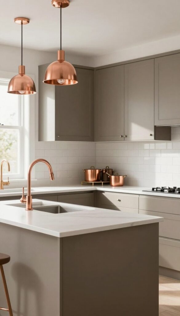
Taupe is one of those colors that does the heavy lifting without screaming for attention. It’s warm, earthy, and forgiving—perfect for a kitchen that actually gets used. Pair it with crisp white countertops and backsplash, and you get a space that feels both grounded and airy.
Then comes copper: a few warm metallic touches here and there, like a faucet or a hanging pot rack, and suddenly the room has a focal point that isn’t about what’s sitting on the counters.
Why It Works
Taupe hides smudges, crumbs, and everyday wear way better than white or light gray ever could. The white surfaces keep things from feeling too heavy, while copper draws the eye upward and around the room—making countertop clutter less noticeable. It’s a clutter-cutting trick that relies on color psychology more than constant tidying.
Best For
This combo works especially well in busy family kitchens or open-plan spaces where you want a calm backdrop that still feels inviting. It’s also great if you love warm neutrals but want something richer than beige.
Styling Tip
Keep copper accents intentional: a pendant light over the island, a faucet at the sink, or a few copper-bottomed pots hanging on a rail. Too much copper can feel gimmicky, so pick two or three spots and let them shine.
FAQ
How do color combinations help reduce kitchen clutter?
The right colors can visually simplify a space by creating a cohesive backdrop that minimizes visual noise. Muted tones and strategic contrasts draw the eye to design features rather than scattered items, making the kitchen feel more organized even when it's not perfectly tidy.
What are the best colors for a small kitchen to avoid clutter?
Light neutrals like cream, soft gray, and pale sage green work well because they reflect light and make the room feel larger. Pairing them with a darker accent on lower cabinets or an island adds depth without overwhelming the space.
Can I use bold colors without making my kitchen look messy?
Yes, if you balance bold hues with plenty of neutral space. For example, a navy blue island paired with white cabinets keeps the bold color contained. Use open shelving sparingly and keep countertops clear to let the color be the star.
How many colors should I use in a kitchen color scheme?
Stick to two or three main colors for a cohesive look. A primary color for cabinets or walls, a secondary for accents or backsplash, and a neutral for balance. Too many colors can create visual clutter.
What finish is best for hiding kitchen mess?
Matte or satin finishes are great because they don't show fingerprints or smudges as easily as glossy finishes. They also absorb light, which helps reduce glare and makes the space feel calmer.
Conclusion
These 11 color combinations prove that a clutter-free kitchen isn't just about what you put away—it's also about what you put on your walls and cabinets. By choosing hues that work together to create a calm, layered look, you can enjoy a space that feels both stylish and serene.
Start with one idea that speaks to you, whether it's sage green and white or terracotta and off-white. Small changes can make a big difference in how your kitchen looks and feels every day.