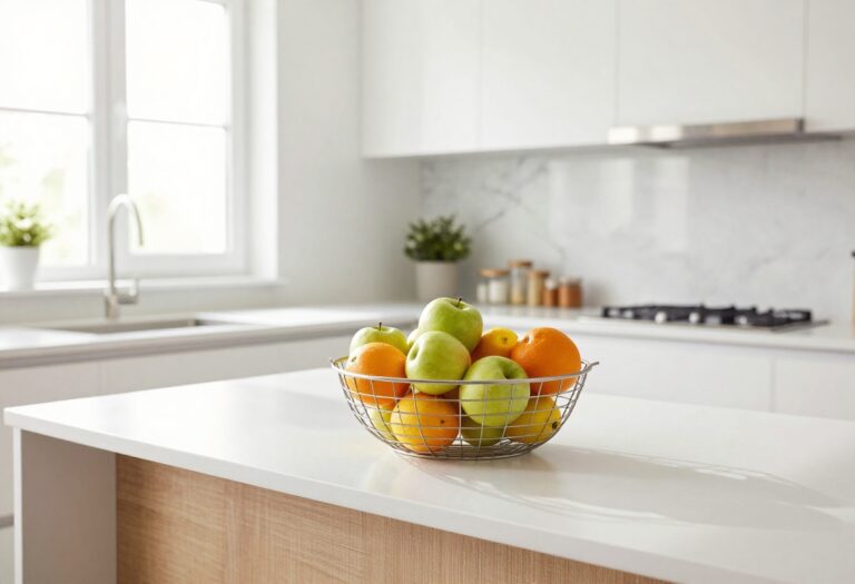
10 Stylish Kitchen Paint Ideas That Make the Room Feel Pulled Together
A fresh coat of paint can do wonders for a kitchen, but the right color and finish can also make the room feel more organized and functional.
When you're short on storage, smart paint choices help define zones, hide clutter, and create a cohesive look without a full remodel.
These ten ideas are designed to be both stylish and storage-smart, so your kitchen feels pulled together from every angle.
1. Two-Tone Cabinets: Light Upper, Dark Lower
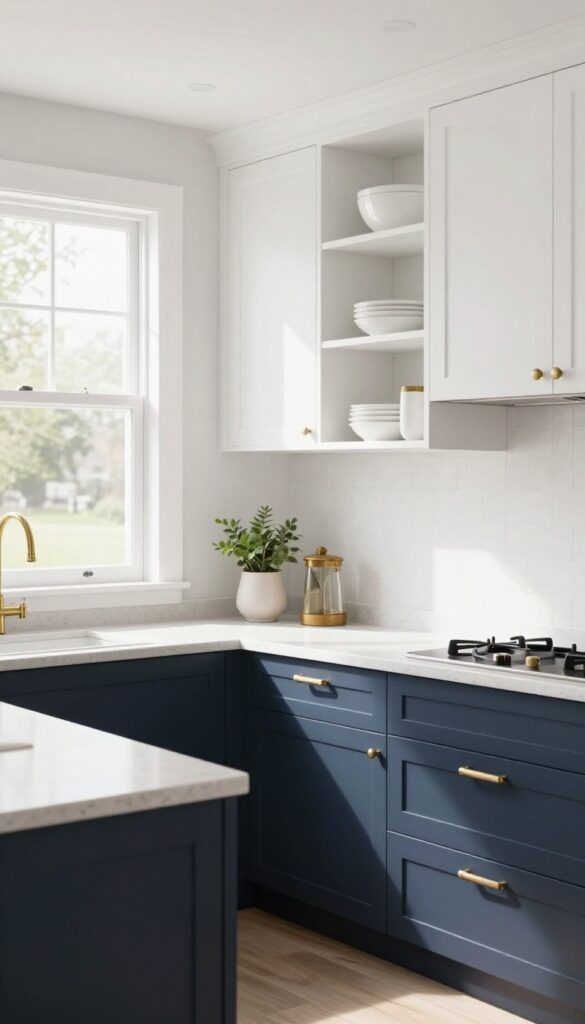
There’s a reason two-tone cabinets have become such a staple in kitchen design. By pairing light uppers with dark lowers, you get the best of both worlds: an open, airy feel up top and a grounded, stable look below. It’s a simple paint strategy that adds depth without overwhelming the space, and it works beautifully in both modern and traditional kitchens.
Why It Works
The contrast draws the eye downward, anchoring the room and making it feel more substantial. Lighter uppers reflect more light, keeping the kitchen bright and spacious, while darker lowers hide everyday scuffs and spills better than any single color could.
Best For
This look is perfect for kitchens with plenty of natural light or those that need a little visual weight at the base. It’s especially effective in open-plan layouts where the kitchen flows into living or dining areas, because the dark lower cabinets help define the cooking zone.
Styling Tip
Keep hardware consistent across both colors—matte black or brushed brass work well. Add open shelving in the same light tone as your uppers to tie everything together, and let your countertop be a neutral bridge between the two shades.
2. Open Shelving Backsplash in a Contrasting Hue
Open shelving is already a favorite for kitchens that want to feel airy and curated. But if you really want to make that storage sing, try painting the wall behind your shelves a bold, contrasting color. Think sage green, terracotta, or even a deep navy.
That pop of color frames everything you place on the shelves—your favorite ceramic mugs, stacked dinner plates, or a little herb plant—and turns them into intentional decor. It’s a low-lift way to add personality without changing your cabinets or countertops.
Why It Works
The painted backsplash creates a visual anchor that draws the eye upward, making your kitchen feel taller and more dynamic. It also adds depth behind open shelves, so dishes and jars don’t just blend into the wall. The contrast makes everyday items look like they belong in a styled photo, which means your storage doubles as art.
Best For
This idea works especially well in kitchens with neutral cabinets (white, light wood, or gray) where the bold color can really stand out. It’s also great for small kitchens because it adds character without taking up floor space. If you have an eat-in kitchen or a breakfast nook with open shelving, this trick makes the whole area feel more intentional.
Styling Tip
Stick to two or three complementary colors on your shelves so the painted wall stays the star. For example, if your backdrop is sage green, use white stoneware, wooden cutting boards, and a few copper accents. Keep the shelves themselves simple—unfinished wood or black metal—so they don’t compete with the wall color.
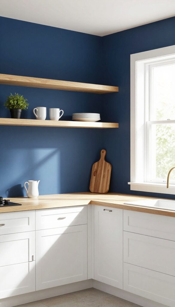
3. A Single Accent Wall in a Deep, Warm Tone
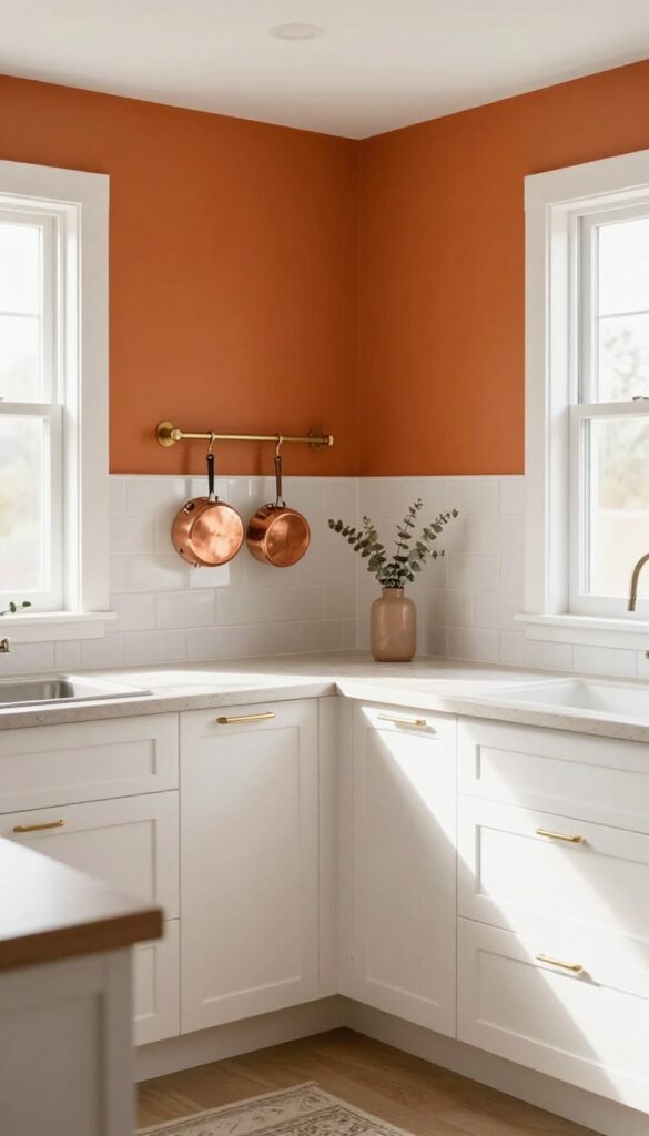
Sometimes the most impactful change is also the simplest. Rather than painting the whole kitchen, choose one wall—maybe behind the stove or sink—and go for a rich shade like burnt orange, deep teal, or even a moody charcoal. That single bold wall instantly becomes the room's anchor, giving it a focal point that makes everything else feel intentional.
It's especially clever in kitchens where counter space is tight because your eye goes straight to that color instead of clutter.
Why It Works
An accent wall adds depth and personality without overwhelming a small kitchen. The deep tone creates visual weight that grounds the space, making it feel more deliberate and pulled together. Plus, it's a low-commitment way to test a dramatic color—if you love it, great; if not, it's just one wall to repaint.
Best For
This works well in galley kitchens or L-shaped layouts where you need a strong design element without sacrificing openness. It's also ideal for renters who can negotiate painting one wall with their landlord or use peel-and-stick wallpaper for a temporary version.
Styling Tip
Balance the dark wall with lighter elements elsewhere—white cabinets, open shelving with airy dishes, or a pale backsplash. Add warm metals like brass or copper in your hardware and light fixtures to tie the deep tone into the rest of the room.
4. Chalkboard Paint for a Functional Message Center
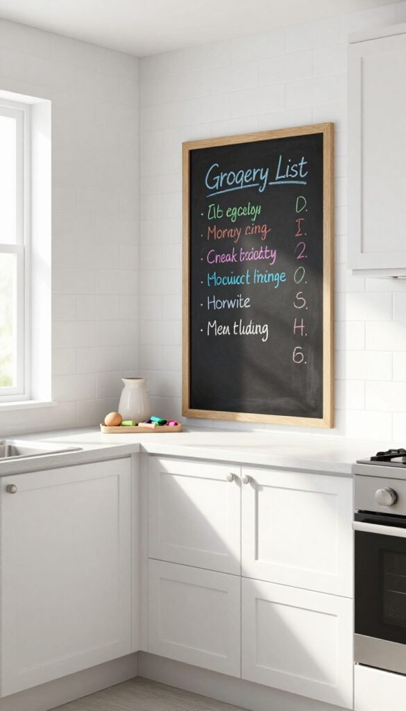
Kitchens are command centers, but they don't have to look like one. A swipe of chalkboard paint turns an empty wall or cabinet side into a spot where grocery lists, meal plans, and sweet notes live. It's playful without being childish and keeps the chaos of daily life a little more contained.
The matte black finish also adds a nice contrast against lighter cabinets or backsplashes.
Why It Works
Chalkboard paint is a zero-commitment way to add function and personality. You can erase and rewrite as often as you like, so it adapts to your family's needs. Plus, it's inexpensive and easy to apply—perfect for renters or anyone who wants a quick refresh.
Best For
This works best in busy kitchens where communication is key—think families with kids or roommates. It's also great for small kitchens where you need every inch to multitask. A narrow strip near the phone or coffee station can make a big difference.
Styling Tip
Frame the chalkboard area with a simple wood or metal border to make it feel intentional rather than makeshift. Keep a small tray of colored chalk nearby and swap out the chalk holder seasonally—a mini pumpkin in fall, a ceramic egg in spring.
5. Magnetic Paint Under a Neutral Top Coat
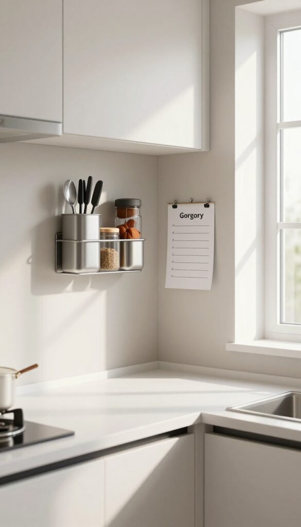
Imagine having a spot in your kitchen where you can stick your favorite spice jars, a small knife strip, or even a grocery list without drilling a single hole. That's exactly what magnetic paint offers, but the trick is to hide it under a regular paint color so it doesn't look like a science project. By applying magnetic paint to a small wall area and then painting over it with a neutral shade, you get all the function without the industrial vibe.
It's one of those ideas that feels both clever and totally doable, especially if you're renting or just don't want to commit to major changes.
Why It Works
Magnetic paint creates instant storage and display space on any wall, but covering it with a neutral top coat keeps the look clean and intentional. The magnets hold sturdy enough for lightweight kitchen tools or notes, yet the finish blends seamlessly with the rest of the room. It's a low-commitment way to add utility without cluttering countertops or damaging walls.
Best For
This works great in small kitchens where every inch of counter space counts, or in rental kitchens where you can't drill into tile or backsplash. It's also perfect for families who want an easy spot for kids' artwork or meal prep checklists without sacrificing style.
Styling Tip
Choose a neutral like warm gray, soft beige, or creamy white for the top coat so it fades into the wall. Keep the magnetic area small—maybe two feet wide near the stove or prep zone—and use matching magnetic containers in metal or glass to maintain a cohesive look. Avoid bright colors that would draw attention to the functional zone.
6. Ceiling Paint in a Soft Pastel for Height
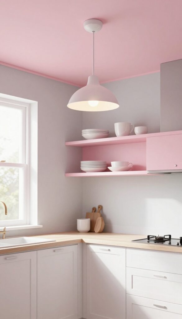
Ceilings often get the short end of the stick when it comes to kitchen design—literally. But painting yours in a soft pastel like pale blue, blush, or mint can completely change how the room feels. It draws the eye upward, making even a compact kitchen feel taller and more open.
Plus, it's a low-commitment way to add color without overwhelming cabinets or countertops.
Why It Works
A lighter ceiling naturally recedes visually, creating the illusion of height. Pastel shades reflect light well, which helps bounce brightness around the room and makes the space feel airier. This trick is especially effective in kitchens with lower ceilings or limited natural light.
Best For
This idea shines in small kitchens, galley layouts, or any kitchen where you want to reduce a boxed-in feeling. It's also great for open-concept homes where the kitchen flows into living areas—the soft color adds subtle distinction without closing off the space.
Styling Tip
Keep walls and cabinets in neutral tones (white, cream, light gray) so the pastel ceiling becomes a gentle focal point. For extra storage-smart benefit, install floating shelves near the ceiling line in a matching pastel—they'll blend in while providing handy display space for rarely used items.
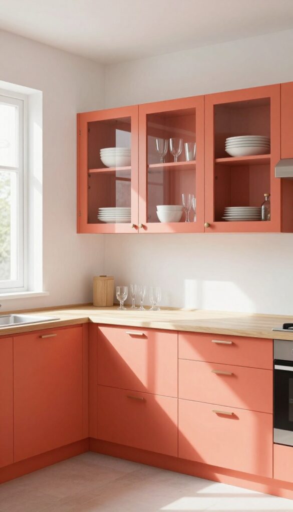
7. Color-Blocked Pantry Door or Cabinet Front
Pantry doors and glass-front cabinets often get overlooked in kitchen design, but they're prime real estate for a playful pop of color. Painting just the inside or a single panel in a bold hue like mustard yellow or emerald green turns a purely functional element into a deliberate style statement. It's a low-commitment way to experiment with color without overwhelming the whole room.
Why It Works
This trick works because it adds visual interest exactly where your eye naturally goes—toward storage. The contrast creates a focal point that makes the kitchen feel more curated and intentional, while the color itself can tie into other accents like bar stools or dish towels.
Best For
Best for kitchens with neutral cabinetry (white, gray, or wood tones) where you want a subtle surprise. It's also perfect for small kitchens that can't handle a full accent wall but still crave personality.
Styling Tip
Keep the rest of the door or cabinet front in your main cabinet color so the color block feels like a deliberate design move, not an afterthought. If you're doing a pantry door, paint the entire inner recess and let the outer frame stay neutral.
8. High-Gloss Trim for Easy Cleaning
Think about all the spots in your kitchen that collect splatters and dust—baseboards, window sills, cabinet edges. Now imagine being able to wipe them clean with a single pass. That's the beauty of high-gloss trim paint.
It gives those hardworking surfaces a sleek, almost lacquered finish that bounces light around the room and makes everything feel a little more polished. Plus, it's one of those storage-smart tricks that keeps your kitchen looking tidy with minimal effort.
Why It Works
High-gloss paint creates a hard, non-porous surface that resists stains and wipes down easily with just a damp cloth. The reflective sheen also helps brighten the room by bouncing natural and artificial light, making even a small kitchen feel more open and airy.
Best For
This works especially well in busy kitchens where messes happen daily—family kitchens, rental properties, or any space where you want low-maintenance style. It's also great for highlighting architectural details like window frames or beadboard without overwhelming the room.
Styling Tip
Pair high-gloss white trim with matte or satin walls in a soft neutral like warm gray or pale beige for contrast. If you want a bolder look, try deep navy or charcoal on the trim for a modern twist—just keep the walls light to maintain balance.
9. A Monochromatic Palette with One Bold Pop
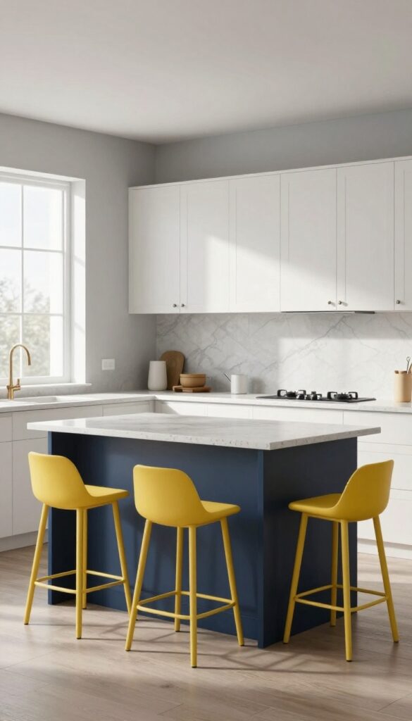
Imagine walking into a kitchen that feels calm and collected, but then your eye lands on one unexpected splash of color. That’s the magic of a monochromatic palette with a single bold accent. By keeping walls, cabinets, and even countertops within the same color family—think soft grays or warm beiges—you create a serene backdrop that makes the space feel bigger and more organized.
Then you add one vibrant element, like a sunny yellow backsplash or a navy blue island, and suddenly the room has personality without chaos. It’s a smart way to introduce color if you’re hesitant to commit to a full rainbow.
Why It Works
A monochromatic scheme visually simplifies the kitchen, which is especially helpful in smaller or open-concept layouts where too many colors can feel cluttered. The single pop of color draws the eye and creates a focal point without competing with other elements. This approach also makes storage areas blend in seamlessly—gray cabinets with gray walls hide pantry doors or appliance garages beautifully.
Best For
This idea shines in kitchens where you want a calm, cohesive look but still crave a bit of personality. It’s perfect for galley kitchens, L-shaped layouts, or any space where you don’t want the cabinetry to fight for attention. If you have open shelving or glass-front cabinets, the monochromatic base lets your dishware become part of the decor without visual noise.
Styling Tip
- Choose your bold accent wisely—it should be something you love seeing every day. A colorful range hood, a painted island, or even bright bar stools work well. Keep the rest of the accessories neutral: think white dishes, wood cutting boards, and simple hardware.
- To tie it all together, repeat the accent color in small doses elsewhere—like a vase on the counter or tea towels—so it feels intentional.
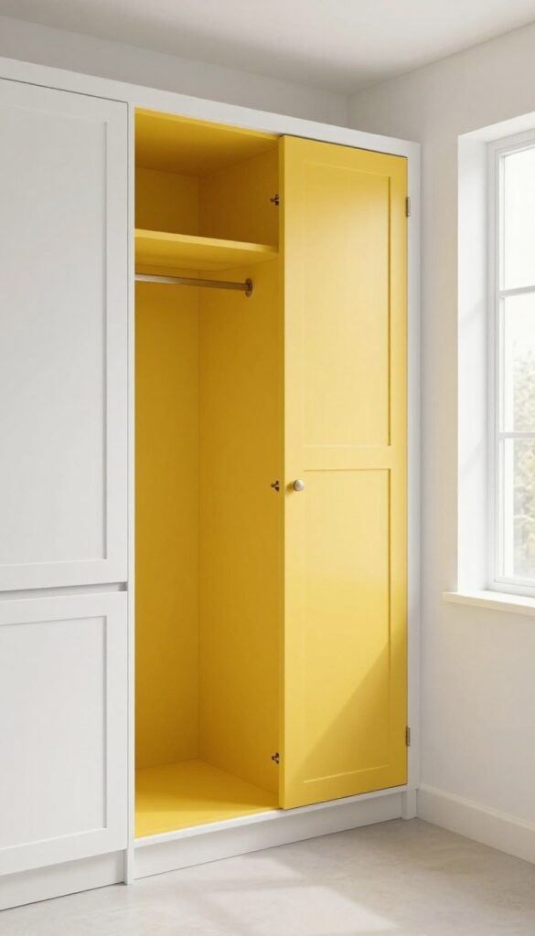
10. Paint the Inside of Open Cabinets a Surprise Color
You know that moment when you open a cabinet and it's just… dark? The same beige or white interior that hides your dishes instead of showing them off. Painting the inside of open cabinets or glass-front doors with a bold color—think coral, teal, or even a deep navy—turns that hidden space into a deliberate design choice.
It's like giving your everyday bowls and mugs a little stage to shine on, without needing to curate a perfect collection.
Why It Works
A pop of color inside the cabinet adds depth and contrast to your kitchen, making the whole room feel more layered and intentional. It draws the eye in and makes even mismatched dishes look like part of a styled vignette. Plus, it's a low-commitment way to test a vibrant hue without painting an entire wall.
Best For
This trick works wonders in kitchens with open shelving or glass-front cabinets, especially if your dishware is mostly neutral or white. It's also great for small kitchens where you want to inject personality without taking up counter or wall space.
Styling Tip
Stick to one bold color per cabinet section to keep it cohesive. If you have multiple open cubbies, paint just the backs of a few for a punchy accent rather than an overwhelming rainbow. Pair with simple white or clear glass dishes so the color really pops.
FAQ
What paint finish is best for kitchen walls?
Eggshell or satin finishes work well for kitchen walls—they're easy to clean and hide imperfections. For cabinets and trim, go with semi-gloss or high-gloss for durability.
How can I make a small kitchen look bigger with paint?
Use light, neutral colors on walls and cabinets, and consider painting the ceiling a shade lighter. Adding a glossy finish on trim also reflects light and opens up the space.
Can I paint my kitchen cabinets without sanding?
Yes, but you'll need a high-quality bonding primer and a deglosser. Clean cabinets thoroughly, apply primer, then paint with a durable cabinet paint for best results.
What are the most popular kitchen paint colors for 2025?
Warm neutrals like creamy white, soft beige, and greige remain popular, along with earthy greens, navy blue, and terracotta accents.
How do I choose a paint color that works with my countertops?
Look at the undertones in your countertops—if they're warm (yellow, beige), choose warm paint colors; if cool (gray, blue), go with cool tones. Test samples on the wall before committing.
Conclusion
Paint is one of the most affordable ways to refresh your kitchen, and with these storage-smart ideas, you can make every color choice work harder for you. Whether you go bold with an accent wall or subtle with a monochromatic scheme, the key is to let your paint do double duty—beautifying while boosting function.
Try one or two of these ideas, and your kitchen will feel more pulled together in no time.