10 Budget-Friendly Kitchen Color Ideas That Make the Room Feel Polished and Put-Together
A fresh coat of paint might be the most affordable way to transform your kitchen, but choosing the right color can feel overwhelming. You want something that looks intentional, not like a rushed decision.
The good news? You don't need a designer or a big budget to get that pulled-together vibe.
These ten color ideas are practical, easy to execute, and guaranteed to make your kitchen feel like it belongs in a magazine—without the hefty price tag.
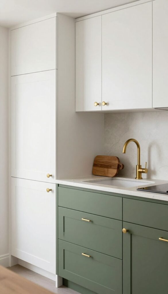
1. Sage Green Cabinets with Warm Wood Accents
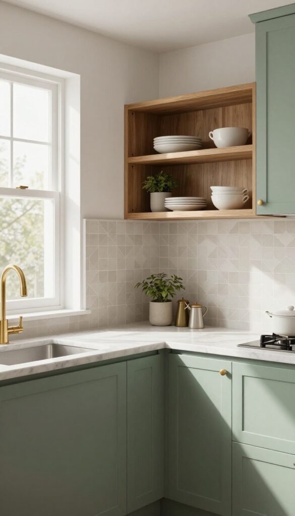
Soft sage green on the lower cabinets instantly brings a kitchen to life without overwhelming the space. It’s a color that feels grounded and natural, especially when you pair it with warm wood open shelving above. This combo works beautifully in rentals where you can’t change everything, or in older kitchens that need a fresh, calming update.
Why It Works
Sage green is incredibly forgiving—it hides smudges and crumbs better than white, yet feels lighter than dark greens. The warm wood adds contrast and texture, making the whole kitchen feel intentional and cozy rather than just painted.
Best For
Renters who want a big impact without a full renovation, or anyone with a dated kitchen looking for a budget-friendly refresh. It also suits kitchens with limited natural light because sage green reflects light softly.
Styling Tip
Use peel-and-stick wallpaper on the backsplash in a subtle geometric pattern to tie the green and wood tones together. Add matte brass hardware on the cabinets for an extra touch of warmth.
2. Butter Yellow on an Accent Wall
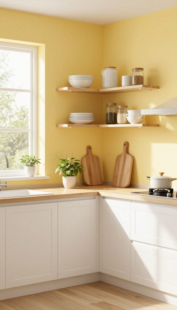
Yellow can be a scary color to commit to, but butter yellow is the friendliest version out there. It’s soft, warm, and feels like a little burst of sunshine without screaming for attention. Painting just one wall in this shade gives your kitchen a happy glow, especially when natural light hits it during the morning hours.
It’s a low-cost way to add personality and warmth, and it pairs beautifully with neutral cabinets and natural wood tones.
Why It Works
An accent wall in butter yellow adds visual interest without overwhelming the room or your budget. A single gallon of paint is all you need, making it one of the most affordable updates you can make. The color lifts the mood and makes the space feel brighter and more inviting, which is exactly what a kitchen should feel like.
Best For
This works great in kitchens that get decent natural light but could use a little more warmth. It’s especially effective behind open shelving or near a breakfast nook where the yellow can anchor the seating area. If your kitchen has white or light gray cabinets, butter yellow will make them pop without clashing.
Styling Tip
Keep the rest of the wall decor simple so the yellow stays the star. Add open shelves with white dishes or glass jars to let the color peek through. A few trailing plants or a wooden cutting board on the counter will tie in the natural warmth and keep the look grounded.
3. Navy Blue Island with White Surroundings
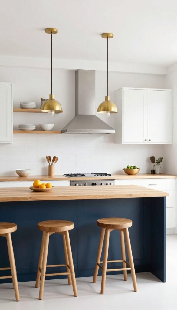
There’s something instantly polished about a navy blue island floating in a sea of white cabinets. It’s one of those color combos that feels both classic and current, like a tailored navy blazer paired with crisp white jeans. The deep hue anchors the room without overwhelming it, while the white keeps things airy and bright.
And since you’re only painting one piece of furniture, it’s a budget-friendly way to get that custom look without a full renovation.
Why It Works
Navy reads as neutral but adds serious depth, so your kitchen doesn’t feel flat or one-note. The contrast draws the eye right to the island, making it the natural gathering spot. Plus, you can change up the rest of the kitchen later—swap hardware or add a backsplash—and the navy will still feel intentional.
Best For
This idea shines in open-concept kitchens where the island is already the star. It also works well in galley or L-shaped layouts that need a strong focal point. If your cabinets are builder-grade white, this is an easy upgrade that makes them look custom.
Styling Tip
Keep the island’s countertop light—white quartz or butcher block keeps things fresh. Add warm wood bar stools or brass pendants overhead to soften the cool navy. A few open shelves on either side of the range hood with white dishes will tie everything together.
4. Terracotta Backsplash Tiles
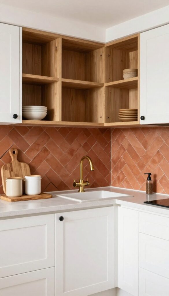
Forget plain white subway tiles — terracotta ones bring a warmth that instantly makes a kitchen feel more inviting. The herringbone pattern adds visual interest without being overwhelming, and the earthy tones pair beautifully with neutral cabinets or open shelving. It’s a look that feels both grounded and stylish, like something you’d see in a sun-drenched Mediterranean home.
Why It Works
Terracotta’s natural reddish-brown hue adds depth and texture to the kitchen, making it feel layered and lived-in. The herringbone layout creates movement that draws the eye, while the material itself is durable and easy to clean — perfect for a busy cooking space.
Best For
This idea shines in kitchens with white or light wood cabinets, where the terracotta can stand out without competing. It also works well in open-plan layouts where you want to define the kitchen zone with a warm accent.
Styling Tip
Keep the rest of the backsplash simple — let the terracotta be the star. Pair it with brass or matte black fixtures for a touch of contrast, and add a few wooden cutting boards or ceramic canisters on the counter to echo the earthy vibe.
5. Soft Blush on Upper Cabinets
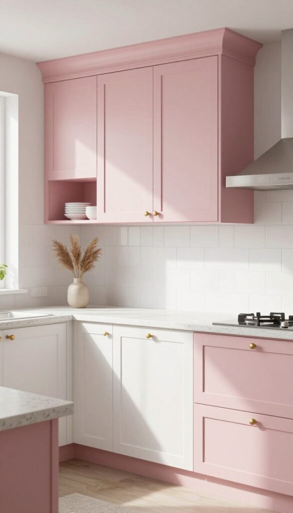
A coat of dusty blush pink on your upper cabinets adds a whisper of color without overwhelming the space. It’s a fresh twist on the all-white kitchen that feels both playful and refined. The softness keeps it from reading as too feminine or trendy, especially when paired with warm brass hardware and neutral countertops.
Why It Works
Blush pink is surprisingly versatile—it complements warm wood tones, white subway tile, and even dark lower cabinets. Because it’s muted, it reads as a neutral with personality, not a loud statement. This approach lets you dip into color without a full commitment or a big budget.
Best For
This works beautifully in kitchens that get good natural light, where the pink can shift from barely-there to a gentle glow throughout the day. It’s also ideal for renters or anyone who wants to refresh only the upper half of the room for maximum impact with minimal cost.
Styling Tip
Keep lower cabinets a crisp white or soft gray to let the blush stand out. Add brushed brass pulls and a simple open shelf with white dishes to keep the look airy. A small vase of eucalyptus or dried pampas grass on the counter ties in the soft, natural vibe.
6. Charcoal Gray Lower Cabinets
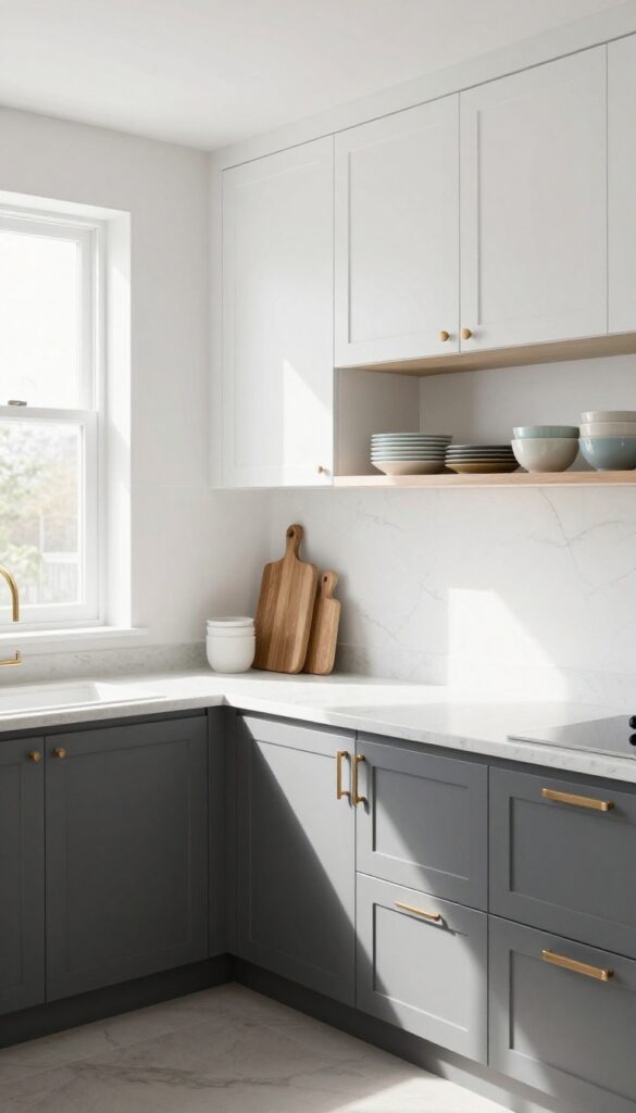
Charcoal gray on lower cabinets is a move that feels both bold and grounded. It adds weight to the room without making it feel dark or closed in, especially when you pair it with light uppers. The contrast creates a natural visual anchor, and honestly, it hides spills and smudges way better than white ever could — a lifesaver for anyone who actually cooks.
Why It Works
By concentrating the darker color on the lower half, you get a sense of stability and depth. It also means less scrubbing because charcoal doesn't show every fingerprint or splash. Plus, it's a budget-friendly way to make stock cabinets look custom without the price tag.
Best For
This look shines in kitchens with good natural light or bright white walls. It's especially great for busy families or anyone who wants a stylish kitchen that doesn't demand constant upkeep.
Styling Tip
Keep counters light — white quartz or butcher block work well — and add warm metal handles in brass or copper to soften the dark tone. Open shelving above can break up the heaviness and give you a spot to display colorful dishes.
7. Mint Green on a Pantry Door
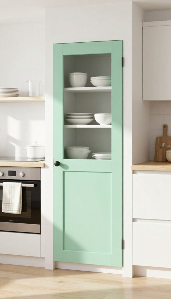
A pop of color doesn't always need a whole wall. Painting just your pantry door a soft mint green can completely shift the energy of your kitchen. It's unexpected but not overwhelming, and it adds a playful retro vibe that feels both nostalgic and fresh.
Best of all, it's a small project that costs next to nothing—perfect if you're looking for a budget-friendly refresh.
Why It Works
Mint green is one of those colors that instantly lifts a room without screaming for attention. Against neutral cabinets or white walls, it becomes a subtle focal point that draws the eye. The door itself is a small surface, so you can experiment with color fearlessly—and if you ever change your mind, it's easy to repaint.
Best For
This idea shines in kitchens that are mostly neutral—think white, gray, or light wood tones. It's especially great for renters (with permission) or anyone who wants to test a bold color without committing to an entire room. A pantry door off the main pathway works best so the color feels like a surprise rather than an intrusion.
Styling Tip
Keep the rest of the door hardware simple—black or brass knobs complement mint green beautifully. Let the door be the star by avoiding busy patterns nearby; solid-color dish towels or simple open shelving keep the look clean. If you want extra charm, paint the inside of the door frame the same shade for a cohesive pop when the door swings open.
8. Warm Beige Walls with White Trim
There's a reason beige is making a serious comeback—it's not the dull, dated shade you might remember. A warm, creamy beige on your walls instantly softens a kitchen, making it feel inviting without sacrificing brightness. Paired with crisp white trim, the contrast feels clean and intentional, not stark or cold.
Why It Works
Beige has a natural warmth that makes wood tones and greenery stand out beautifully, so your kitchen feels layered and lived-in. It's also forgiving—dirt and smudges show less than on pure white walls, which is a huge win for busy households.
Best For
This combo works in any kitchen style, from modern farmhouse to mid-century to traditional. It's especially great for north-facing kitchens that need a little warmth without going dark.
Styling Tip
Stick with one or two accent colors—like sage green or terracotta—to keep the look cohesive. Add open shelving with wooden cutting boards and ceramic jars to lean into that cozy, natural vibe.
9. Dusty Blue on Open Shelving Backsplash
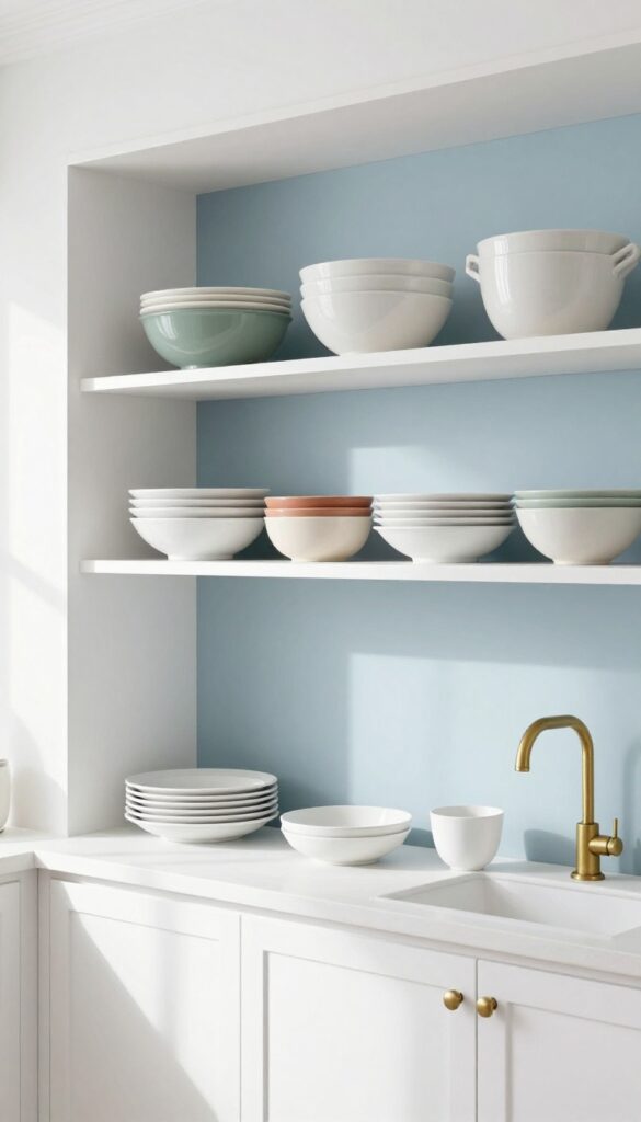
Open shelving is a great way to show off your favorite dishes, but the wall behind them often gets overlooked. Instead of tiling the entire backsplash, paint that wall a soft dusty blue. The color peeks through your plates and glasses, adding a calm, collected vibe without committing to painted cabinets.
It’s a budget-friendly tweak that makes your kitchen feel thoughtfully designed.
Why It Works
Dusty blue is a neutral with personality—it pairs well with white dishes, wood tones, and even brass accents. By painting just the backsplash area, you get a pop of color that feels intentional but not overwhelming. Plus, it’s easy to change if your taste evolves.
Best For
This idea works beautifully in kitchens with open shelving already installed or planned. It’s especially effective in small kitchens where you want color without making the space feel closed in.
Styling Tip
Keep your dishware mostly white or cream so the blue really stands out. Add a few pieces in complementary hues like sage green or terracotta for depth. Finish with a simple brass faucet or hardware to tie the look together.
10. Two-Tone Cabinets: White Upper, Olive Green Lower
Olive green has been popping up everywhere lately, and for good reason. It brings a natural, calming vibe that works beautifully in kitchens. Pairing olive green lower cabinets with crisp white uppers gives you that trendy two-tone look without going overboard.
The white keeps things bright and airy, while the green adds depth and a grounded feel. It’s a combination that feels fresh but not fleeting.
Why It Works
This setup creates visual separation in the kitchen without needing an island or open shelving. The darker lowers hide everyday wear and tear better than all-white cabinets, so you get both style and practicality. Plus, olive green pairs well with warm wood tones, brass hardware, and natural stone, making it easy to layer in other finishes.
Best For
Mid-sized kitchens with good natural light where you want to introduce color without committing to an all-over bold look. It’s also great for kitchens that lack architectural detail because the two-tone treatment adds instant character.
Styling Tip
Stick with simple shaker-style cabinet doors to keep the look clean and budget-friendly. Swap out standard knobs for unlacquered brass pulls—they’ll patina over time and add warmth that plays off the olive tone.
FAQ
What are the cheapest ways to add color to a kitchen?
Painting cabinets, adding a backsplash, or using peel-and-stick wallpaper are all budget-friendly options. Even just painting an accent wall or a pantry door can make a big difference.
How do I choose a kitchen color that won't go out of style?
Stick with nature-inspired tones like sage green, navy, or warm beige. These colors have lasting appeal and pair well with many styles.
Can I mix two different cabinet colors?
Absolutely. Two-tone cabinets (like white uppers and colored lowers) are a popular way to add personality while keeping the look balanced.
What color makes a small kitchen look bigger?
Light, airy colors like soft white, pale gray, or light blue can make a small kitchen feel more spacious. Reflective surfaces also help.
How do I test a paint color before committing?
Buy sample pots and paint large swatches on different walls. Observe them at various times of day to see how lighting affects the color.
Conclusion
Updating your kitchen with a fresh color doesn't have to cost a fortune or require a total renovation. Whether you paint cabinets, add a backsplash, or just refresh an accent wall, these ideas prove that small changes can make a big impact.
Pick the one that feels right for your space and enjoy a kitchen that finally feels pulled together.