9 Elegant Kitchen Cabinet Color Ideas That Cut Clutter Fast
Kitchen cabinets take up a lot of visual real estate. When they're dark or busy, the whole room can feel heavy and cluttered—even if everything is put away. The right color changes that.
A lighter, more elegant palette tricks the eye into seeing more space and less stuff. These nine cabinet color ideas focus on cutting clutter without sacrificing style. Each one brings a clean, airy vibe that makes your kitchen feel bigger and more organized.
Think soft tones that reflect light and create a sense of calm. Whether you're planning a full remodel or just want to refresh what you have, these shades are practical, beautiful, and easy to live with.
1. Soft White with Warm Undertones
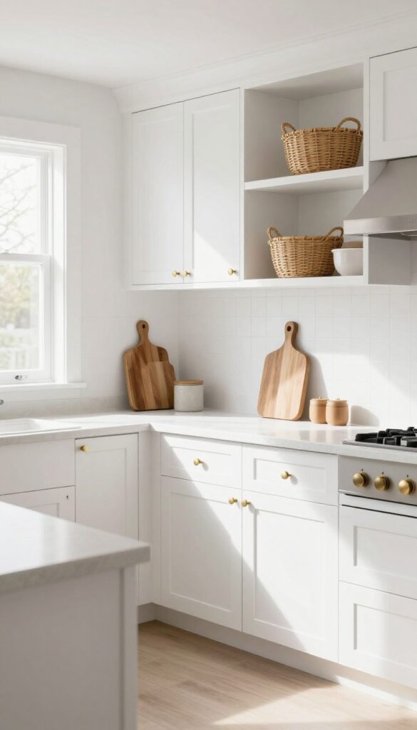
A kitchen painted in soft white with warm undertones feels like a deep breath. It's bright enough to keep the space open and airy, but that subtle hint of cream or beige stops it from feeling cold or clinical. In real homes, this shade does something clever: it hides daily smudges far better than crisp white, so you spend less time wiping and more time cooking.
Why It Works
Warm white cabinets bounce light around the room without creating glare, making the kitchen feel larger and more inviting. They also act as a neutral backdrop that lets your countertops, backsplash, and hardware shine without competing for attention.
Best For
This color works beautifully in kitchens with limited natural light, where pure white can look flat or gray. It's also a smart choice for busy family kitchens where cabinets see a lot of handling.
Styling Tip
Pair warm white cabinets with matte brass or brushed nickel pulls to enhance the cozy undertone. Add a natural wood cutting board or woven baskets on open shelves to reinforce the soft, grounded feel.
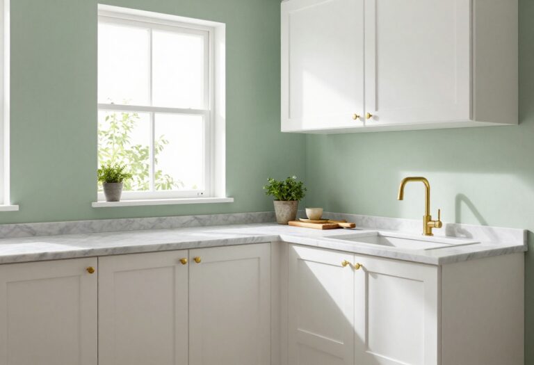
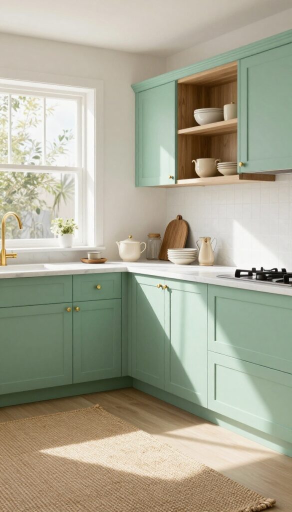
2. Pale Sage Green
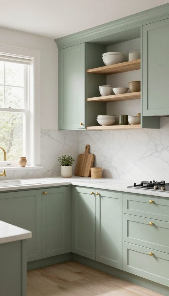
A muted sage green brings a breath of fresh air into the kitchen without overwhelming the space. This soft, earthy hue keeps things light and airy, making even compact kitchens feel open and serene. It's a color that feels both grounded and uplifting, like a gentle nod to nature.
Why It Works
Pale sage green reflects natural light beautifully, helping the room feel brighter and more spacious. Its calming undertone reduces visual clutter by creating a cohesive backdrop that doesn't compete with countertops or open shelving.
Best For
This shade works wonders in kitchens with lots of natural light or white accents. It's especially flattering in smaller spaces where you want color without sacrificing an open feel.
Styling Tip
Pair pale sage cabinets with unlacquered brass pulls and a white marble backsplash for a classic yet fresh look. Add open wooden shelves with a few ceramic pieces to keep the vibe relaxed and organic.
3. Dusty Blue
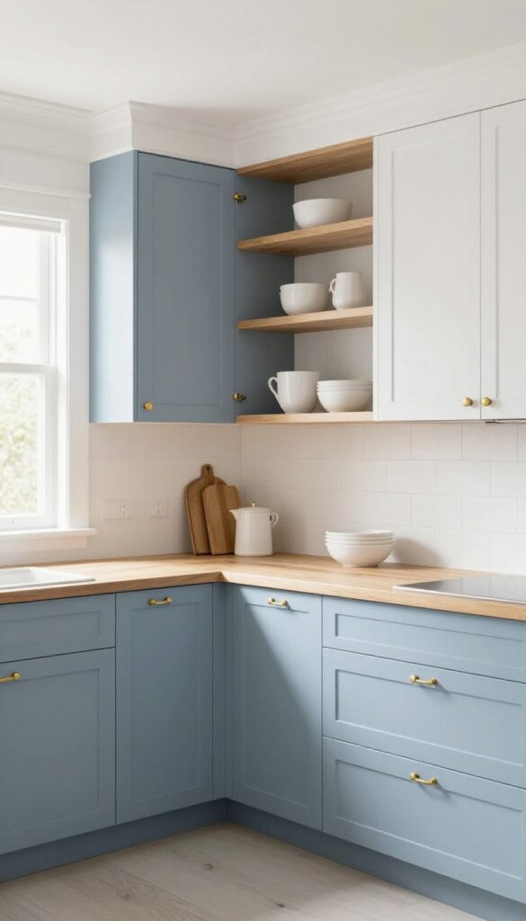
Soft, muted blue brings a breath of fresh air into the kitchen without going full coastal. Dusty blue lands somewhere between gray and sky, giving cabinets a gentle color story that feels both calm and refined. It pairs beautifully with natural wood and white open shelving, creating a look that's light, collected, and anything but cold.
Why It Works
Dusty blue reads as a neutral with personality. It adds visual interest without dominating the room, so your kitchen stays airy and open. The muted tone also hides smudges and fingerprints better than high-gloss white or dark navy, making it a practical choice for busy households.
Best For
This shade works wonders in kitchens that get lots of natural light. It's especially flattering in galley layouts or smaller spaces where you want color but can't afford to lose visual square footage. Warm wood floors or butcher-block counters will make the blue sing.
Styling Tip
Stick with matte or satin finishes to keep the softness intact. Pair dusty blue lower cabinets with white uppers for balance, then add brass or unlacquered brass hardware for a subtle warm contrast. Open shelves in the same wood tone as your countertops tie everything together seamlessly.
4. Light Gray with Blue Undertones
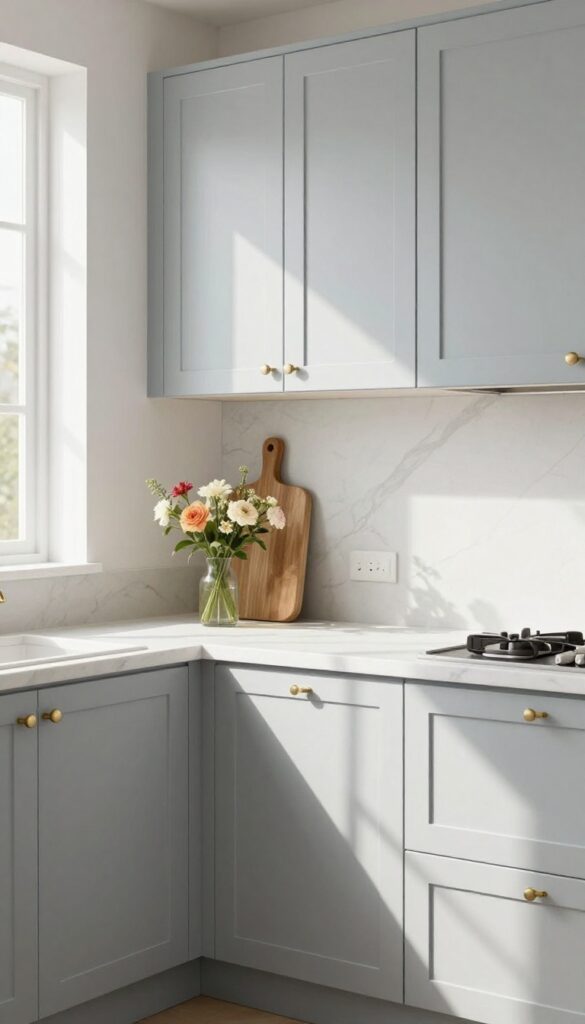
Gray cabinets can sometimes feel too flat or cold, but when you choose a light gray with subtle blue undertones, the whole kitchen softens. This shade catches daylight beautifully, making the space feel open and breezy without any heaviness. It’s a smart choice if you want something neutral that still has a little personality.
Why It Works
The blue undertones prevent the gray from looking dull or washed out. Instead, the color shifts gently depending on the light, adding depth and interest. It also pairs effortlessly with warm wood accents or crisp white countertops.
Best For
This color works especially well in kitchens that don’t get a ton of natural light. The lightness helps bounce around whatever light is available, making the room feel larger and more inviting.
Styling Tip
To keep the look airy, stick with matte finishes for the cabinets and add brushed nickel or chrome hardware. A pale marble backsplash or simple white subway tile will reinforce the clean, fresh vibe.
5. Creamy Beige
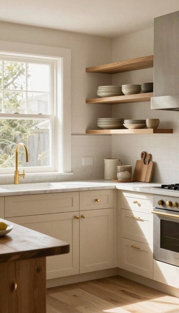
Creamy beige strikes that perfect balance between crisp white and warm neutral. It softens the kitchen without making it feel dark or heavy, and it reflects light beautifully to keep the space airy. Unlike stark white, which can show every smudge, creamy beige hides fingerprints and dust between cleanings — a practical win for busy households.
Why It Works
This shade adds warmth without sacrificing lightness, so your kitchen feels cozy but still open and bright. It also pairs effortlessly with natural wood tones, marble countertops, and brushed brass hardware, creating a layered look that’s both elegant and lived-in.
Best For
Creamy beige is ideal for kitchens that get lots of natural light but want to avoid the sterile feel of pure white. It’s also a great choice for open-concept homes where the kitchen flows into living or dining areas — the soft tone bridges different zones without clashing.
Styling Tip
Pair creamy beige cabinets with matte black or oil-rubbed bronze pulls for subtle contrast. Add a warm wood butcher-block island or open shelving with ceramic dishes in earthy tones to reinforce the cozy, inviting vibe.
6. Blush Pink
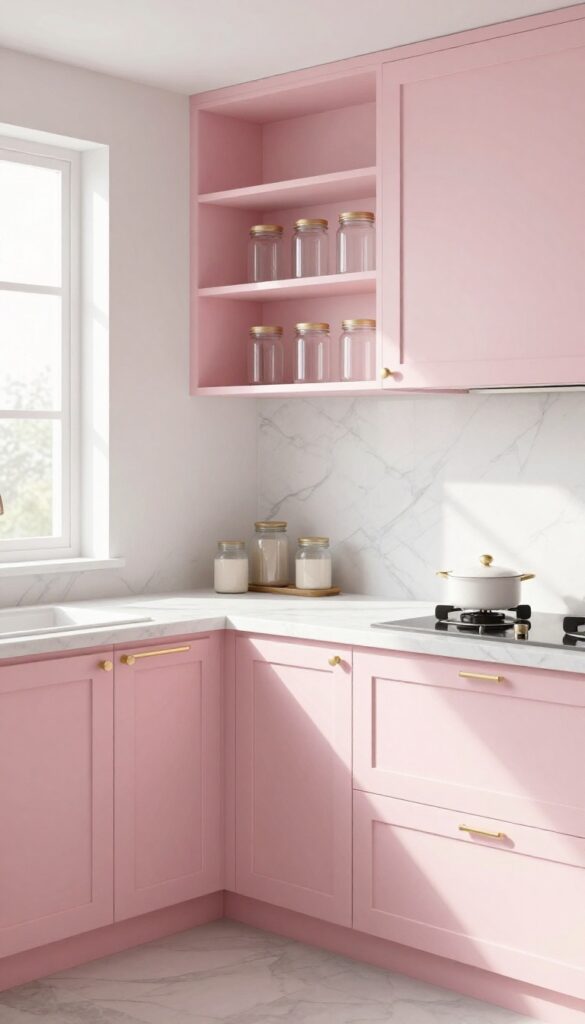
Soft blush pink cabinets bring a gentle warmth that feels both fresh and refined. Unlike brighter pinks, this muted shade reads as sophisticated and pairs beautifully with cool whites and warm metallics. In a light-filled kitchen, blush cabinets create a serene backdrop that makes the space feel larger and more inviting.
Why It Works
Blush pink is surprisingly versatile—it softens the hard lines of cabinetry without overwhelming the room. Its subtle hue reflects natural light, enhancing the airy feel while adding just enough color to keep the kitchen from feeling sterile.
Best For
This works especially well in kitchens with lots of natural light and white or marble countertops. It's ideal for homeowners who want a feminine touch without going full pastel, and it complements both modern and traditional styles.
Styling Tip
Pair blush cabinets with brushed gold or brass hardware for an elegant contrast. Add a white marble backsplash and open shelving with clear glass jars to maintain the light, open look.
7. Buttermilk Yellow
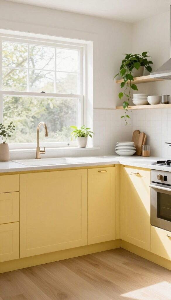
Imagine a kitchen that feels like a warm hug on a cloudy morning. Buttermilk yellow cabinets do exactly that—they bring in sunshine without screaming for attention. This soft, creamy shade sits right between white and pale butter, adding just enough color to make the space feel cheerful and lived-in.
It keeps the room open and airy while giving it a gentle personality that never feels overwhelming.
Why It Works
Buttermilk yellow reflects light beautifully, making small or north-facing kitchens feel brighter and more spacious. Unlike stark white, it adds warmth that makes the room inviting, yet it's pale enough to avoid the visual weight of stronger yellows. This balance helps reduce visual clutter because the cabinets blend softly with walls and countertops, creating a seamless, calming backdrop.
Best For
This color shines in kitchens with limited natural light or those that need a mood boost without going bold. It's also perfect for cottage-style homes, farmhouse kitchens, or any space where you want a cozy but uncluttered feel. If you love color but worry about commitment, buttermilk yellow is an easy first step.
Styling Tip
Pair buttermilk yellow cabinets with matte brass or brushed nickel hardware for a subtle contrast that feels polished. Keep countertops light—white quartz or butcher block works beautifully—and add open shelving with white dishes and trailing plants to keep the look fresh. Avoid heavy dark countertops; they can weigh down the airy vibe.
8. Seafoam Green
A kitchen painted in seafoam green feels like a breath of fresh air. This pale, cool tone sits somewhere between mint and sage, bringing a soft coastal vibe without feeling themed. It’s especially stunning in spaces that get plenty of natural light, where the color shifts from barely-there to a gentle wash of green throughout the day.
Why It Works
Seafoam green is light enough to keep a kitchen feeling open and airy, but it has enough pigment to add real personality. It pairs effortlessly with white countertops, brass hardware, and natural wood accents, creating a look that’s polished but not fussy.
Best For
This color is ideal for kitchens that already feel bright or get southern exposure. It also works beautifully in galley kitchens or smaller spaces where you want color without darkening the room.
Styling Tip
Balance the coolness of seafoam with warm touches like unlacquered brass pulls, a woven jute rug, or open shelving with ceramic dishes in cream and terra-cotta. Avoid pairing it with stark white—opt for off-white or warm cream instead.
9. Warm Taupe
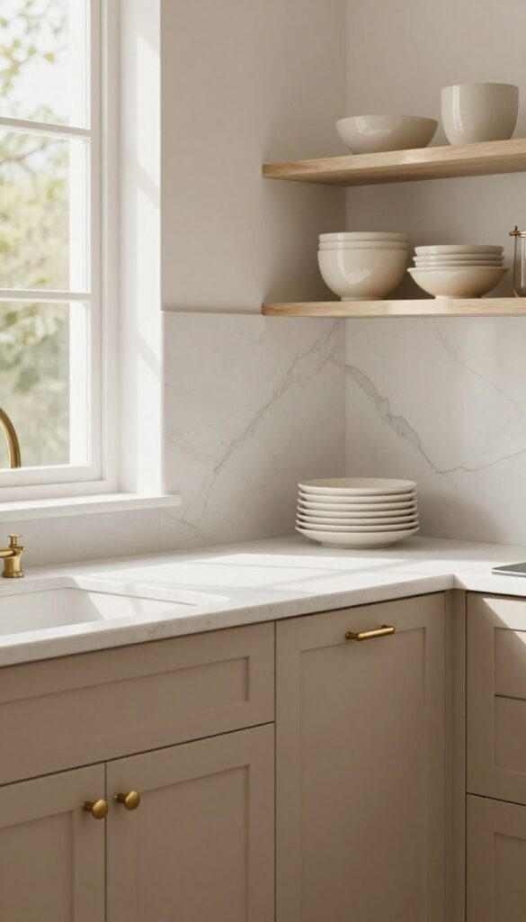
Warm taupe sits right in that sweet spot between beige and gray, offering a neutral that feels grounded without being heavy. In a kitchen, it brings a soft, earthy richness that makes the space feel instantly more inviting—like a cozy café rather than a sterile work zone. Because it’s light enough to keep things airy but has enough depth to add character, warm taupe cabinets work beautifully in both modern and traditional kitchens.
Why It Works
Warm taupe reflects light nicely, so it won’t darken your kitchen the way deeper browns or grays can. Its subtle undertones shift slightly depending on the lighting—sometimes looking almost mushroom, other times leaning toward a soft greige—which keeps the space feeling dynamic without being busy.
Best For
This shade is ideal for kitchens that get moderate natural light and need a neutral that doesn’t wash out or feel cold. It’s especially flattering in open-concept layouts where you want the kitchen to blend seamlessly with adjacent living areas.
Styling Tip
Pair warm taupe cabinets with matte brass or brushed nickel hardware for a soft contrast. White quartz countertops and open shelving with cream ceramics will keep the look light and layered, while a pale marble backsplash adds just enough texture.
FAQ
What cabinet color makes a kitchen look bigger?
Light colors like soft white, pale gray, and creamy beige make a kitchen look larger by reflecting natural light. These shades open up the space visually and reduce the feeling of clutter.
Are light-colored cabinets hard to keep clean?
Not necessarily. Matte finishes and warm undertones hide smudges better than glossy pure white. Regular wiping with a damp cloth keeps them looking fresh.
Can I mix cabinet colors in the same kitchen?
Yes, mixing upper and lower cabinets in different light shades adds depth. For example, soft white uppers with pale sage lowers keep the room airy while adding interest.
What hardware goes best with light cabinet colors?
Brass, gold, or brushed nickel hardware complements light cabinets nicely. They add a touch of elegance without overpowering the soft color palette.
Will light cabinet colors go out of style?
Light neutrals are timeless. While trends shift, shades like soft white, beige, and pale gray have remained popular for decades because they create a calm, open feel.
Conclusion
Choosing the right cabinet color can transform your kitchen from cluttered to calm. These nine elegant shades keep the space light and airy while making it feel more organized. Whether you go with soft white or dusty blue, each option brings a sense of openness that helps cut visual clutter fast.
Remember, the best color is one that makes you happy every time you walk into the room. Pair it with simple hardware and minimal countertop decor to let the cabinets shine.