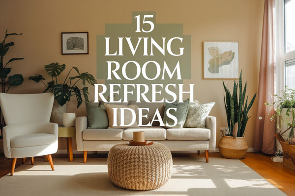
9 Living Room Color Palette Ideas That Work
Color is the fastest way to make a living room feel “done” without buying a single new piece of furniture. It can fix awkward layouts, make cheap décor look intentional, and even make a small room feel less cramped.
But picking a palette sounds easy until you’re staring at 47 paint swatches wondering why every beige looks slightly… angry.
Most living rooms don’t need dramatic makeovers, they just need better color decisions. Once the palette makes sense, everything else gets easier, like rugs, pillows, curtains, and wall art.
And yes, it’s totally possible to make your living room look designer-level without spending designer-level money.
1. Warm White + Natural Wood + Black Accents
Most living rooms feel messy because there’s no visual “anchor,” so everything blends into a soft, forgettable blur.
Warm white walls fix that instantly, especially when you pair them with natural wood furniture and sharp black accents.
This palette is clean without feeling cold, and it works in almost any style, from modern to farmhouse to cozy minimalist. I’ve used this combo in more than one space, and it always makes the room feel calmer and more expensive.
Warm white keeps the space bright, but natural wood adds warmth so it doesn’t feel sterile. Black accents give the room contrast, which is what makes everything look intentional.
This is the kind of palette that makes even basic furniture feel like you planned it. And honestly, it’s hard to mess up.
Why This Works
Warm white acts like a blank canvas, but it’s softer than stark white, so it feels inviting instead of clinical. Natural wood brings organic texture, which keeps the room from feeling flat. Black accents add definition, like eyeliner for your living room, and that contrast makes the space look structured.
The balance here is the magic. You get lightness, warmth, and sharp contrast all at once, which is why this palette works in tiny apartments and big open living rooms. It also makes décor swaps super easy, because almost anything looks good with these colors.
How to Do It
- Choose a warm white paint (not bright white) to avoid a harsh look.
- Pick one or two wood tones and stick to them, so the room doesn’t look random.
- Add black through hardware, frames, lamps, or a coffee table base for contrast.
- Use soft neutral textiles like beige or oatmeal curtains to keep it cozy.
- Add one statement piece like a black-framed mirror or bold black floor lamp.
Each step matters because this palette depends on balance. If you skip the black, the room can look washed out, and if you overdo black, it can feel heavy. The wood is what keeps everything grounded.
Style & Design Tips
Go for wood tones that feel warm, like oak, walnut, or acacia, because cool gray wood can make the room feel lifeless. Use black accents sparingly but consistently, so the eye sees repetition. The best way to do this is to spread black across the room instead of clustering it in one corner.
Avoid shiny black everywhere because it can feel harsh. Matte black looks way more modern and expensive. Also, keep your warm whites consistent, because mixing creamy white with bright white trim can look accidental.
Pro Tip or Budget Hack
If your furniture is mismatched, unify it with black. Swap out drawer pulls, add black curtain rods, or use black frames for wall art. It’s one of the cheapest ways to make random furniture look like a coordinated set.
2. Greige + Soft Ivory + Muted Olive
Some living rooms feel “unfinished” because everything is too neutral, but not in a stylish way. Greige solves that because it’s not fully gray and not fully beige, so it adds depth without feeling gloomy. When you layer it with soft ivory and muted olive, you get a palette that feels calm, earthy, and grown-up. It’s like the room version of someone who drinks water and has their life together.
Muted olive adds color without screaming for attention. Ivory keeps things soft, so it doesn’t become too dark or heavy. This palette feels cozy but still polished, and it’s amazing if you want your living room to look modern without looking trendy.
Why This Works
Greige creates a neutral foundation with more complexity than plain beige. Ivory brightens the room while keeping it warm and welcoming. Olive brings in nature vibes, which makes the room feel relaxed and layered instead of flat.
The biggest win is how this palette hides everyday life. Dust, pet hair, and small scuffs don’t stand out as much on greige and olive tones. It’s a practical palette that still looks stylish.
How to Do It
- Paint walls greige or choose a greige sofa as your base.
- Add ivory through curtains, rugs, or larger pillows for softness.
- Use muted olive in accent pillows, throws, or a statement chair.
- Bring in natural textures like jute, linen, or woven baskets.
- Add warm brass or black accents to keep it grounded.
This works best when olive stays muted. If it gets too bright or too yellow, it can look dated fast. The ivory helps the palette breathe, so the room doesn’t feel heavy.
Style & Design Tips
Stick with warm greige, not cool gray, unless you want your living room to feel like an office waiting room. Olive looks best in matte fabrics like velvet, linen, or cotton, not shiny satin finishes. Add a few dark wood touches to make it feel richer.
One common mistake is going too monochrome. If everything is greige, it looks dull. You need the ivory contrast and olive accents to keep the room alive.
Pro Tip or Budget Hack
Buy olive pillow covers instead of new pillows. You can instantly change the vibe of the room for cheap, and you can swap them seasonally. Olive works in fall and winter but still looks fresh in spring.
3. Navy Blue + Crisp White + Warm Tan
Some living rooms feel boring because the colors never commit to anything. Navy fixes that problem because it’s bold but still classic, and it makes the room feel instantly more stylish. Pair it with crisp white and warm tan, and you get a palette that looks clean, expensive, and timeless. It’s the kind of color combo that makes guests assume you know what you’re doing.
Navy gives depth and drama, while white keeps the space bright. Tan adds warmth so the room doesn’t feel too sharp or cold. I’ve seen this palette make cheap living rooms look like they belong in a high-end magazine.
Why This Works
Navy works like a neutral, but it has more personality than gray or beige. White creates contrast and makes navy feel fresh instead of heavy. Tan balances the coolness of navy by bringing in warmth, which makes the whole room feel livable.
This palette also works beautifully with gold accents, wood furniture, or even black metal. It’s versatile, but it still feels intentional because navy is such a strong anchor color.
How to Do It
- Use navy as a main feature, like an accent wall, sofa, or large rug.
- Add white through trim, curtains, or a light-colored coffee table.
- Bring in tan with leather furniture, woven baskets, or beige textiles.
- Add a few brass or gold details to elevate the look.
- Keep patterns simple, like stripes or subtle geometrics.
Navy needs white to prevent the room from feeling dark. Tan is what keeps it from feeling too “nautical theme party.” If you do it right, it looks classy instead of coastal cliché.
Style & Design Tips
Choose true navy, not royal blue, because royal blue can look childish fast. Warm tan looks best in leather, wood tones, or textured rugs. White should be crisp, but avoid overly bright, blue-toned white, because it can clash with tan.
Don’t add too many blue accessories. Let navy be the star and use other colors for smaller accents. Otherwise, your room can start looking like a sports bar without the TVs.
Pro Tip or Budget Hack
If you’re scared of navy walls, do navy curtains instead. Long navy curtains instantly make a living room feel taller and more luxurious, and it’s easier to change later if you get bored.
Get the Free Aesthetic Lifestyle Starter Pack
A simple printable bundle to help you reset your week, refresh your space, build better habits, and feel more put together.
4. Charcoal Gray + Blush Pink + Light Oak
Some living rooms feel harsh because they lean too dark or too industrial. Charcoal gray can look amazing, but it needs softness to avoid feeling like a parking garage. That’s where blush pink comes in, and yes, it works even if you don’t want your living room to look “girly.” When you add light oak into the mix, it becomes modern, warm, and surprisingly cozy.
Charcoal gives depth and mood, blush adds softness, and oak brings natural warmth. This palette feels trendy but not in a fast-fashion way. It looks sophisticated, but still comfortable enough to actually live in.
Why This Works
Charcoal is a strong neutral that anchors the room and makes it feel more modern. Blush adds warmth and subtle color, which keeps charcoal from feeling cold or depressing. Light oak adds texture and natural brightness, so the palette stays balanced.
The contrast here is what makes it work. Dark and light, soft and structured, modern and warm. It’s like the room has personality without trying too hard.
How to Do It
- Use charcoal on one wall, a sofa, or a large rug as your base.
- Add blush through pillows, artwork, or a throw blanket.
- Bring in light oak furniture like a coffee table or shelving.
- Add white accents to keep the room from feeling heavy.
- Use black metal or matte brass for finishing touches.
This palette works best when blush stays subtle. It’s an accent, not the main event. Oak is important because it prevents charcoal from taking over the entire vibe.
Style & Design Tips
Avoid bubblegum pink or anything too bright, because it ruins the sophisticated feel. Stick to dusty blush tones that look muted and soft. Use charcoal in matte finishes because shiny charcoal can look cheap.
Light oak pairs beautifully with woven textures like rattan or jute. Don’t mix too many wood tones, though, because oak already has a distinct look. Keep the room clean and intentional.
Pro Tip or Budget Hack
If you already have gray furniture, add blush with removable pillow covers and art prints. You don’t need to repaint anything. Blush is one of those colors that instantly makes a gray room look styled instead of accidental.
5. Sage Green + Cream + Soft Gold
Some living rooms feel chaotic because the colors are too loud or too mismatched. Sage green fixes that by bringing in color that feels calm instead of dramatic. When you pair it with cream and soft gold accents, the whole room starts looking peaceful and polished. It’s basically the “Pinterest living room” palette, but for good reason, because it genuinely works.
Sage green feels fresh without being trendy in an annoying way. Cream keeps everything warm and inviting. Soft gold adds a little glow that makes the space feel more upscale.
Why This Works
Sage green is calming because it sits in that perfect middle zone between neutral and color. Cream adds warmth and keeps sage from feeling too cool. Gold brings in contrast and elegance without making the room feel flashy.
This palette also works well with natural textures. Plants look amazing, wood furniture fits right in, and even woven baskets feel intentional. It’s one of the easiest palettes to make look “finished.”
How to Do It
- Paint walls sage green or use sage in a large rug or sofa.
- Add cream textiles like curtains, rugs, or large pillows.
- Bring in gold through lamps, frames, or side table legs.
- Use warm wood furniture for a natural look.
- Add greenery like plants or botanical prints to enhance the palette.
Gold needs to stay soft, not bright yellow. Cream should feel warm, not stark white. Sage should lean muted, not neon green. The whole point is calm, not chaos.
Style & Design Tips
Mix textures to avoid a flat look. Sage looks amazing in velvet, linen, or matte paint finishes. Cream should have texture too, like boucle pillows or chunky knit throws. Gold works best in brushed or antique finishes, not shiny chrome-style gold.
A common mistake is using too much sage. If everything is green, it can feel like a garden center. Use it as the anchor, then let cream dominate the softer areas.
Pro Tip or Budget Hack
Spray paint old frames or lamp bases with a brushed gold finish. It’s shockingly cheap and makes your décor look way more expensive. Just don’t go wild and gold-spray your entire living room like it’s a trophy room.
6. Terracotta + Warm Beige + Deep Brown
Some living rooms feel cold and lifeless because the palette doesn’t have enough warmth. Terracotta fixes that instantly because it brings in earthy richness without feeling too dark. Pair it with warm beige and deep brown, and you get a cozy palette that feels grounded, stylish, and a little Mediterranean. It’s like your living room suddenly learned how to cook good food and listen to vinyl records.
Terracotta adds personality, beige keeps it soft, and deep brown adds weight and sophistication. This palette feels especially good in fall and winter, but it still works year-round if you keep the tones balanced.
Why This Works
Terracotta feels warm because it sits between orange and brown, so it brings color without being too bright. Beige keeps the room from looking heavy and adds a soft backdrop. Deep brown grounds everything and makes the palette feel rich.
This combination also looks amazing with natural materials. Leather, clay pottery, woven baskets, and wood furniture all feel like they belong. It creates a layered, cozy vibe without feeling cluttered.
How to Do It
- Use terracotta in pillows, rugs, or wall art if you don’t want to paint.
- Choose warm beige walls or large furniture to keep things balanced.
- Add deep brown through wood furniture, leather accents, or shelving.
- Use black sparingly for contrast, like frames or lamp bases.
- Add texture with woven décor, pottery, or linen curtains.
Terracotta works best as an accent unless you’re going bold. Beige needs to stay warm, not gray-toned. Brown should feel rich, like walnut or espresso, not dull.
Style & Design Tips
Terracotta looks best with matte textures, not glossy finishes. Use warm beige that leans creamy instead of gray. Deep brown furniture should have visible grain or texture, because flat brown can look cheap.
Avoid pairing terracotta with bright primary colors, because it ruins the earthy vibe. Stick to muted tones and natural textures. If you want extra depth, add a little muted olive or dusty rust.
Pro Tip or Budget Hack
Instead of buying terracotta décor, look for clay planters or pottery at thrift stores. Even one terracotta vase or bowl on a coffee table can pull the whole palette together. It’s the easiest “designer trick” that barely costs anything.
7. Dusty Blue + Soft Gray + Whitewashed Wood
Some living rooms feel too busy because everything is fighting for attention. Dusty blue calms that down because it’s muted and soft, but still gives you color. When you pair it with soft gray and whitewashed wood, the room feels airy and organized without looking sterile. It’s like coastal style, but without the seashell obsession.
Dusty blue adds gentle color, gray adds neutrality, and whitewashed wood keeps it light. This palette works especially well if your living room doesn’t get a ton of natural light, because it reflects brightness without needing bright white everywhere.
Why This Works
Dusty blue feels relaxing because it’s not intense, and it pairs beautifully with both warm and cool tones. Soft gray provides a clean neutral base without feeling dull. Whitewashed wood adds texture and brightness, which keeps the room feeling open.
This palette also makes spaces feel visually larger. Lighter colors reflect more light, and the muted tones keep everything cohesive. It’s great for smaller apartments or living rooms with awkward layouts.
How to Do It
- Use dusty blue on an accent wall, sofa, or rug.
- Add soft gray through upholstery, pillows, or curtains.
- Bring in whitewashed wood furniture like a coffee table or TV stand.
- Use white trim or white décor accents for brightness.
- Add texture with woven baskets or chunky knit throws.
Dusty blue should feel muted and calm, not bright or bold. Gray should stay soft and warm-toned, not icy. Whitewashed wood should look natural, not overly distressed.
Style & Design Tips
Avoid too many cool grays, because the room can start feeling cold. Add warmth through beige accents, cream pillows, or warm lighting. Use natural fabrics like linen and cotton to keep the palette looking relaxed.
One common mistake is adding too many “coastal” props. You don’t need anchors, boats, or fake coral. Keep it clean and modern and let the colors do the work.
Pro Tip or Budget Hack
Whitewashed wood furniture can be expensive, but you can fake it. Lightly sand a dark wood piece and use a diluted white paint wash to create that soft, worn finish. It’s messy, but it works, and it’s way cheaper than buying a new table.
8. Emerald Green + Cream + Brass
Some living rooms feel boring because everything is safe, neutral, and forgettable. Emerald green is the exact opposite of that. It adds drama, richness, and a “designer” look without feeling tacky if you pair it with cream and brass. This palette feels bold but still classy, like it belongs in a fancy apartment where people casually own books they’ve actually read.
Emerald gives the room depth, cream softens it, and brass adds warmth and shine. I love this palette because it makes even basic furniture look expensive, especially when you add velvet or textured fabrics.
Why This Works
Emerald green has natural depth, so it instantly adds richness. Cream balances it out by keeping the space light and open. Brass adds warmth and a little luxury, which prevents emerald from feeling too heavy or too “dark academic.”
This palette also works beautifully with plants, wood furniture, and layered textures. It feels lush and cozy at the same time. It’s bold, but it doesn’t feel like a trend you’ll regret in six months.
How to Do It
- Use emerald as your main statement, like a sofa, accent wall, or large rug.
- Add cream curtains, rugs, or pillows to soften the look.
- Bring in brass through lamps, frames, or cabinet handles.
- Add wood tones like walnut or oak to keep it grounded.
- Use black sparingly for contrast, like side tables or picture frames.
Emerald should feel deep and rich, not neon green. Cream should be warm, not stark. Brass should lean brushed or antique, not shiny gold disco-ball energy.
Style & Design Tips
Emerald looks best in velvet, linen, or matte paint finishes. Glossy emerald can look cheap fast. Brass accents should repeat around the room, so it feels intentional. Keep your cream pieces textured, like boucle pillows or woven rugs, to prevent the room from feeling flat.
Avoid mixing emerald with too many bright colors. A little blush or navy can work, but keep it minimal. Emerald is already doing enough.
Pro Tip or Budget Hack
If you can’t afford an emerald sofa, get emerald velvet pillow covers. They instantly add that luxury vibe without the luxury price. Pair them with cream pillows and one brass lamp, and your living room will look like you tried way harder than you actually did.
9. Mocha Brown + Soft Taupe + Dusty Rose
Some living rooms feel dated because they rely too heavily on plain brown tones without layering. Brown can look gorgeous, but it needs contrast and softness to avoid looking like an old furniture showroom. That’s why mocha brown, soft taupe, and dusty rose work so well together. It’s warm, cozy, and modern in a subtle way.
Mocha brown gives the room richness and depth. Taupe smooths everything out and keeps it neutral. Dusty rose adds a hint of color that makes the whole palette feel updated instead of stuck in 2004.
Why This Works
Mocha brown grounds the space and makes it feel cozy and luxurious. Taupe acts as a bridge between brown and dusty rose, so the palette feels blended instead of random. Dusty rose adds warmth and softness, which keeps brown from feeling too heavy or dull.
This palette also works beautifully with layered textures. Think plush rugs, soft curtains, and warm wood furniture. It feels inviting, and it hides mess well, which is always a win.
How to Do It
- Use mocha brown in large furniture pieces like a sofa, leather chair, or coffee table.
- Add taupe through wall paint, rugs, or curtains for a soft neutral base.
- Bring in dusty rose with pillows, artwork, or a throw blanket.
- Add warm metallic accents like brass or bronze for depth.
- Use creamy whites sparingly to keep the palette from feeling too dark.
Mocha brown should look rich, not muddy. Taupe should feel warm and soft. Dusty rose should stay muted, not bright pink. The goal is subtle elegance, not Barbie dreamhouse.
Style & Design Tips
Use matte fabrics like linen or cotton for dusty rose, because shiny rose tones can look cheap. Mocha brown looks best in leather, wood, or textured upholstery. Taupe should stay consistent throughout the room, because mixing taupe with gray can make things feel off.
Avoid too many dark brown pieces in one area, because the room can start feeling heavy. Break it up with taupe textiles and dusty rose accents spread across the space.
Pro Tip or Budget Hack
If you already have a brown couch, don’t replace it. Just style it correctly. Add taupe curtains, a textured taupe rug, and dusty rose pillow covers, and suddenly your “basic brown couch” looks intentional and cozy instead of outdated.
Final Thoughts
A good living room palette isn’t about following trends, it’s about making your space feel balanced and easy to decorate. Once the main colors make sense, every throw pillow, rug, and piece of wall art suddenly becomes way less stressful to pick. That’s the real win.
If you’re stuck, pick one palette and commit for at least a few months. Most living rooms don’t need more stuff, they just need better color decisions and a little consistency.
Get the Free Aesthetic Lifestyle Starter Pack
A simple printable bundle to help you reset your week, refresh your space, build better habits, and feel more put together.