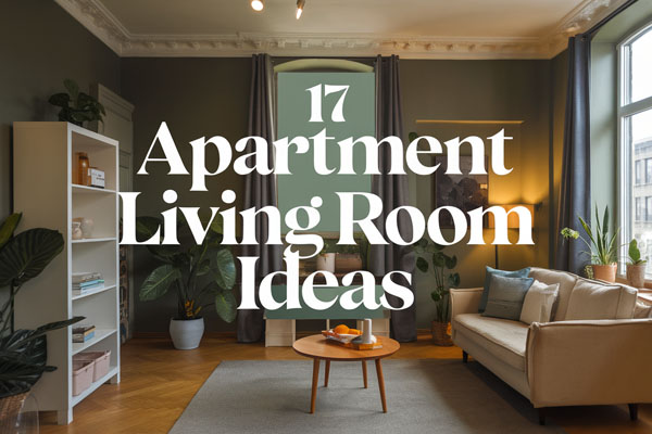
8 Smart Deck Layout Ideas for Better Flow
Function usually determines whether a deck feels relaxing or frustrating to use. Poor layout choices create awkward walking paths, crowded seating zones, and spaces that somehow look large but feel unusable.
A smart deck layout fixes movement first, then style naturally follows without forcing decorative solutions.
Most people focus on furniture before thinking about how people actually move through the space. That’s where layouts quietly succeed or fail.
Once flow improves, everything from hosting friends to drinking coffee outside becomes easier without needing a bigger deck.
1. Zoned Deck Layout for Dining and Lounging
Trying to use one open deck for everything usually leads to furniture constantly being rearranged. Chairs drift into walking paths, tables feel oversized, and the space never quite settles into a comfortable rhythm. Dividing the deck into clear zones solves this without adding square footage.
I learned this after squeezing a dining set and lounge chairs together on a medium-sized deck that always felt cluttered. The moment I separated functions into defined areas, the deck suddenly felt intentional instead of improvised.
Why This Works
People naturally move between activities, so creating zones mirrors how outdoor spaces are actually used. Clear separation reduces visual noise and prevents furniture from competing for attention.
Defined areas also help guests understand where to sit or gather without needing direction. The deck starts guiding behavior quietly, which makes hosting feel effortless.
How to Do It
- Place dining furniture closest to the house for easy kitchen access
- Use an outdoor rug to visually anchor the lounge area
- Keep at least a 3-foot walking path between zones
- Angle seating inward to create conversation flow
- Add planters or low benches as subtle dividers
Each step creates invisible boundaries that organize movement without building walls.
Style & Design Tips
Choose complementary colors instead of identical furniture sets so zones feel connected but distinct. Mixing textures like wood, wicker, and metal adds depth without cluttering the layout.
Avoid pushing all furniture against railings because it creates a hollow center that feels awkward. Balanced spacing makes the deck feel curated rather than crowded.
Pro Tip or Budget Hack
Use inexpensive outdoor rugs or even painted deck sections to define zones instead of buying new furniture. A simple layout shift often creates the biggest transformation for almost zero cost.
2. Perimeter Seating Layout for Open Movement
Center-heavy furniture layouts block movement faster than people expect. When sofas or tables sit in the middle, everyone walks around obstacles instead of through the space. Moving seating toward the perimeter instantly improves flow.
I once resisted this idea because I thought edge seating would feel formal, but it actually opened the deck dramatically. Suddenly, kids could move freely and hosting stopped feeling like navigating a maze.
Why This Works
Keeping the center open creates a natural circulation path. Human movement prefers clear routes, so removing obstacles reduces subconscious tension while walking.
It also visually enlarges smaller decks because uninterrupted floor space tricks the eye into seeing more room.
How to Do It
- Position benches or chairs along railings
- Leave the central area mostly open
- Add a small movable table instead of a large fixed one
- Use corner seating to maximize unused areas
- Maintain consistent spacing between pieces
These adjustments prioritize movement first, decoration second.
Style & Design Tips
Low-profile furniture works best along edges because tall pieces can feel enclosing. Choose lighter frame colors if the deck is small to maintain openness.
Avoid overcrowding corners since too many items cancel out the benefit of perimeter placement. Negative space is part of the design, not empty space to fill.
Pro Tip or Budget Hack
Built-in bench seating costs less than multiple chairs over time and saves space. Even a simple DIY wooden bench dramatically improves layout efficiency.
3. Multi-Level Deck Layout for Natural Separation
When one flat deck tries to handle multiple activities, everything blends together visually and functionally. Adding levels introduces structure without needing walls or partitions. Even a small height difference changes how the space feels.
I used to think multi-level decks were only for large homes, but a single step-down area completely transformed a modest backyard deck I helped redesign.
Why This Works
Elevation naturally signals different purposes to the brain. A raised dining area feels formal, while a lower lounge space encourages relaxation.
Levels also guide traffic flow because people instinctively move between platforms in logical patterns.
How to Do It
- Create a one-step drop for lounge seating
- Keep dining areas level with indoor flooring
- Use wide steps for safety and seating flexibility
- Add lighting along level transitions
- Maintain consistent materials across levels
The goal is subtle separation, not dramatic height changes.
Style & Design Tips
Use the same deck stain color across levels to maintain cohesion. Contrast should come from furniture and accessories rather than flooring changes.
Avoid narrow steps because they interrupt flow and feel unsafe. Wide transitions make the layout feel intentional and welcoming.
Pro Tip or Budget Hack
Instead of rebuilding the deck, create a faux level using raised platforms or outdoor tiles under furniture. The visual effect works surprisingly well for less money.
4. Corner Conversation Layout for Social Flow
Large seating arrangements often fail because conversations stretch too far apart. People lean forward awkwardly or shift chairs constantly to connect. A corner-focused seating layout naturally brings everyone together.
I noticed gatherings lasted longer when seating wrapped around a corner instead of spreading across the deck. People stayed relaxed because interaction felt effortless.
Why This Works
Corners create psychological comfort by offering subtle enclosure. This encourages longer conversations and makes spaces feel cozy without closing them off.
It also frees up remaining deck space for movement or additional functions.
How to Do It
- Place an L-shaped sofa or sectional in one corner
- Add a central coffee table within reach of all seats
- Keep one side open for entry flow
- Use layered lighting for evening comfort
- Angle chairs slightly inward
Every placement supports communication rather than decoration alone.
Style & Design Tips
Soft cushions and layered textures help prevent corner layouts from looking rigid. Mixing throw pillows in two or three tones keeps the setup relaxed.
Avoid oversized furniture that overwhelms the corner. Proportion matters more than size when creating comfort.
Pro Tip or Budget Hack
Use two separate loveseats instead of buying a sectional. Arranged correctly, they create the same effect for much less money.
5. Dining-Focused Linear Layout for Narrow Decks
Long, narrow decks often frustrate homeowners because traditional layouts block movement. Placing furniture across the width instead of along the length creates constant bottlenecks. A linear arrangement fixes this immediately.
I’ve seen narrow decks completely change personality once furniture followed the deck’s natural shape instead of fighting it.
Why This Works
Aligning furniture with the longest dimension maintains walking flow. People move smoothly from one end to the other without squeezing past chairs.
The layout also emphasizes length, making tight spaces feel intentionally designed rather than constrained.
How to Do It
- Position the dining table parallel to deck boards
- Use benches instead of bulky chairs
- Leave one continuous walking side open
- Choose rectangular furniture shapes
- Keep décor minimal along pathways
These steps prevent congestion while maximizing usability.
Style & Design Tips
Stick to slim-profile furniture and lighter materials. Heavy pieces visually shrink narrow decks quickly.
Avoid round tables in tight layouts because they disrupt linear flow. Straight lines reinforce movement and improve comfort.
Pro Tip or Budget Hack
A DIY bench against the railing replaces multiple chairs and saves both money and walking space.
6. Outdoor Living Room Layout with Defined Entry Path
Many decks lack a clear entrance point, which makes movement feel random. Guests step onto the deck and hesitate because there’s no obvious direction. Creating an intentional entry path solves this instantly.
After adding a simple walkway gap through furniture on my own setup, people naturally followed it without thinking. The deck finally felt organized instead of scattered.
Why This Works
Defined pathways reduce decision fatigue. When movement feels intuitive, spaces feel larger and more welcoming.
It also protects furniture arrangements from constant disruption caused by people cutting through seating areas.
How to Do It
- Leave a straight path from door to main seating area
- Use planters or lighting to subtly guide direction
- Keep pathway width at least 3 feet
- Arrange seating around—not inside—the path
- Anchor the space with a central rug
Each step creates visual guidance without obvious barriers.
Style & Design Tips
Use contrasting textures along the path, like smooth decking beside a textured rug. This difference quietly signals where walking should happen.
Avoid blocking sightlines from the entrance. First impressions shape how spaces are used more than decoration does.
Pro Tip or Budget Hack
Solar lights or inexpensive lanterns along the path create structure and ambiance simultaneously without electrical work.
7. Flexible Modular Layout for Changing Needs
Permanent furniture layouts don’t always match real life. Some days you want quiet lounging, other days you’re hosting six people and moving chairs nonstop. Modular layouts adapt without frustration.
I switched to lightweight modular seating after one too many gatherings spent rearranging heavy furniture, and honestly, it changed how often I used the deck.
Why This Works
Flexibility supports multiple activities without redesigning the space. Movable pieces allow layouts to evolve naturally based on use.
This approach also prevents visual fatigue because arrangements can change seasonally.
How to Do It
- Choose modular sofas or stackable chairs
- Use lightweight side tables
- Store extra seating nearby
- Keep layout symmetrical for easy rearranging
- Avoid permanently fixed décor pieces
Mobility becomes the main design feature.
Style & Design Tips
Stick to a consistent color palette so rearranged furniture still looks cohesive. Neutral bases with interchangeable cushions work best.
Avoid overly delicate furniture since outdoor pieces need durability. Function should always lead style in flexible spaces.
Pro Tip or Budget Hack
Outdoor poufs double as seating, tables, or footrests, making them one of the most versatile low-cost additions you can buy.
8. Nature-Integrated Layout Using Planters as Boundaries
Decks sometimes feel disconnected from the yard, especially when surrounded by plain railings. Using planters as layout tools blends structure with greenery while guiding movement naturally.
I underestimated how powerful plants could be until adding tall planters created instant privacy and flow without construction.
Why This Works
Plants soften edges while defining space gently. Unlike walls, greenery shapes movement without making areas feel confined.
Natural elements also reduce visual harshness, helping the deck feel like an extension of the landscape.
How to Do It
- Place tall planters to separate zones
- Use herbs or grasses for texture variation
- Keep pathways clear between planter groupings
- Match planter materials to deck tones
- Vary plant heights for layered depth
Plants become architectural elements rather than decoration.
Style & Design Tips
Stick to two or three plant varieties for cohesion. Too many species make the layout feel chaotic instead of curated.
Avoid blocking views entirely unless privacy is needed. Strategic openness keeps the deck breathable.
Pro Tip or Budget Hack
Grow herbs or edible plants instead of ornamental ones. You get layout structure and usable ingredients at the same time, which always feels like a win.
Final Thoughts
Smart deck layouts rarely require bigger budgets or dramatic renovations. Most improvements come from understanding movement, spacing, and how people actually use outdoor areas day to day. Small adjustments often deliver the biggest comfort upgrades.
Experiment a little and rearrange without overthinking perfection. The best layouts usually come from testing what feels natural over time, and honestly, that trial-and-error process is half the fun anyway.