10 Clever Kitchen Color Palette Ideas That Make the Room Feel Pulled Together
A kitchen that feels pulled together isn't about matching everything perfectly. It's about choosing colors that flow naturally, creating a space that feels both intentional and lived-in. The right palette can turn a chaotic room into one that welcomes you every time you walk in.
Maybe you're tired of your kitchen feeling disjointed, or perhaps you're starting fresh and want a scheme that works. Either way, these ten color ideas focus on warmth and real-life livability.
No sterile whites or cold grays here—just palettes that feel like home. Each idea is designed to be achievable, whether you're painting cabinets, swapping backsplash tiles, or just adding new accessories.
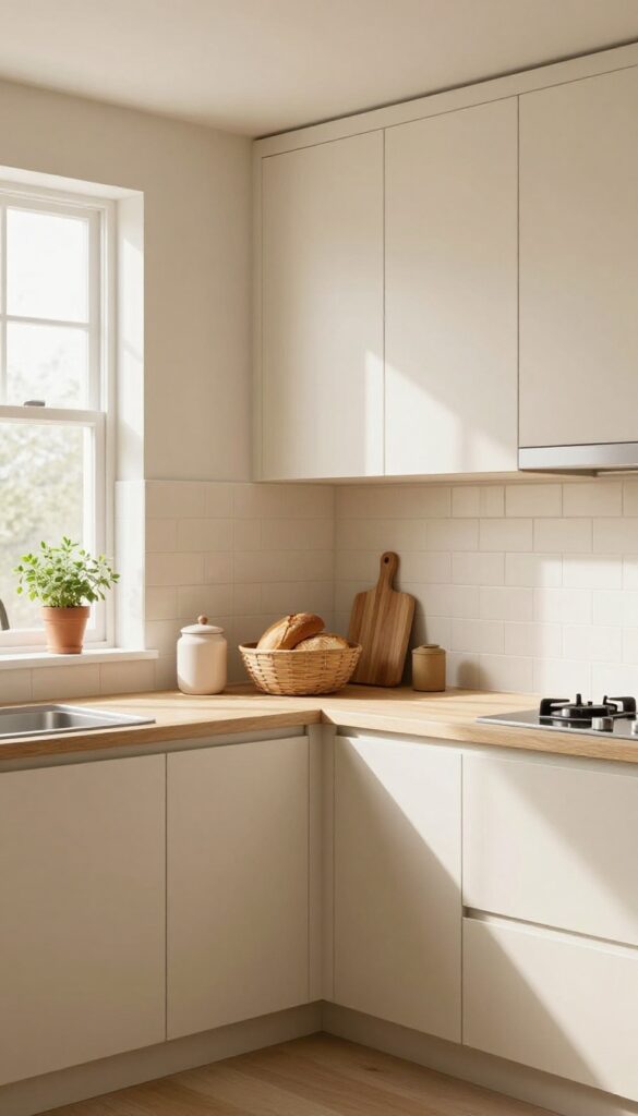
1. Creamy White and Warm Wood
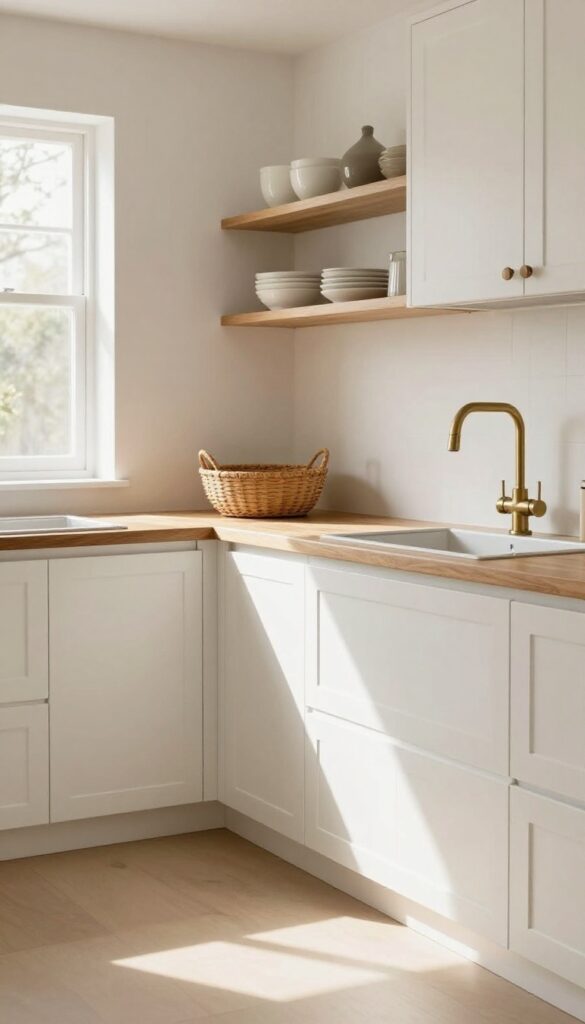
There’s a reason creamy white kitchens never go out of style—they feel clean, bright, and endlessly inviting. But plain white can sometimes fall flat. That’s where warm wood steps in.
By pairing soft off-white cabinetry with natural wood accents like open shelving or butcher block countertops, you get a kitchen that feels cozy and grounded, not cold or sterile. The wood adds just enough warmth to make the space feel lived-in, while the creamy backdrop keeps everything airy.
Why It Works
The contrast between the soft white and the rich grain of the wood creates visual interest without being busy. Wood brings an organic, tactile quality that balances the smoothness of painted cabinets, making the room feel layered and approachable. Plus, this combo works with almost any kitchen size—it can make a small space feel bigger while adding character to a larger one.
Best For
This palette is perfect for kitchens that get good natural light, as the creamy white will reflect it beautifully. It also suits homes with an open floor plan where you want the kitchen to flow into living areas without feeling too stark or too rustic.
Styling Tip
Add brass hardware and woven baskets to bring in more texture and warmth. Brass pulls or knobs catch the light nicely against the white cabinets, and baskets on open shelves or countertops soften the look while providing practical storage.
2. Sage Green and Terracotta
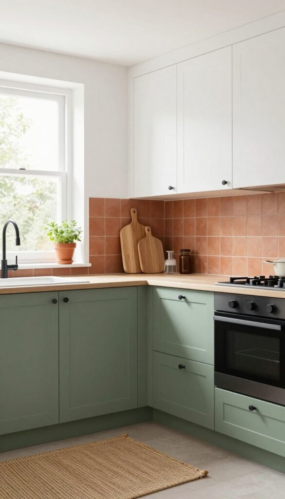
There’s something about pairing sage green with terracotta that just feels like a warm hug. The soft, muted green on lower cabinets brings a sense of calm, while the clay-toned backsplash adds a touch of earthiness and warmth. It’s a combo that feels both grounded and inviting, without trying too hard.
White upper cabinets keep things airy, so the room doesn’t feel heavy, and matte black fixtures add just enough contrast to make it all feel intentional.
Why It Works
Sage green is one of those colors that instantly relaxes a space, and terracotta brings in a natural warmth that prevents the kitchen from feeling cold or sterile. Together, they create a balanced palette that feels organic and lived-in. The white uppers reflect light, making even small kitchens feel open, while the matte black hardware grounds the look with a modern edge.
Best For
This idea is perfect for anyone who wants a kitchen that feels cozy but not dark, and stylish but not trendy. It works especially well in kitchens with good natural light, where the green can really shine. If you love earthy tones and want a space that feels like a retreat from the busy world, this is your match.
Styling Tip
To tie the whole look together, bring in natural textures like a woven rug or wooden cutting boards on the counter. Add a few terracotta pots with herbs on the windowsill to echo the backsplash. Keep countertops clutter-free to let the color combo be the star.
3. Navy Blue and Brass Accents
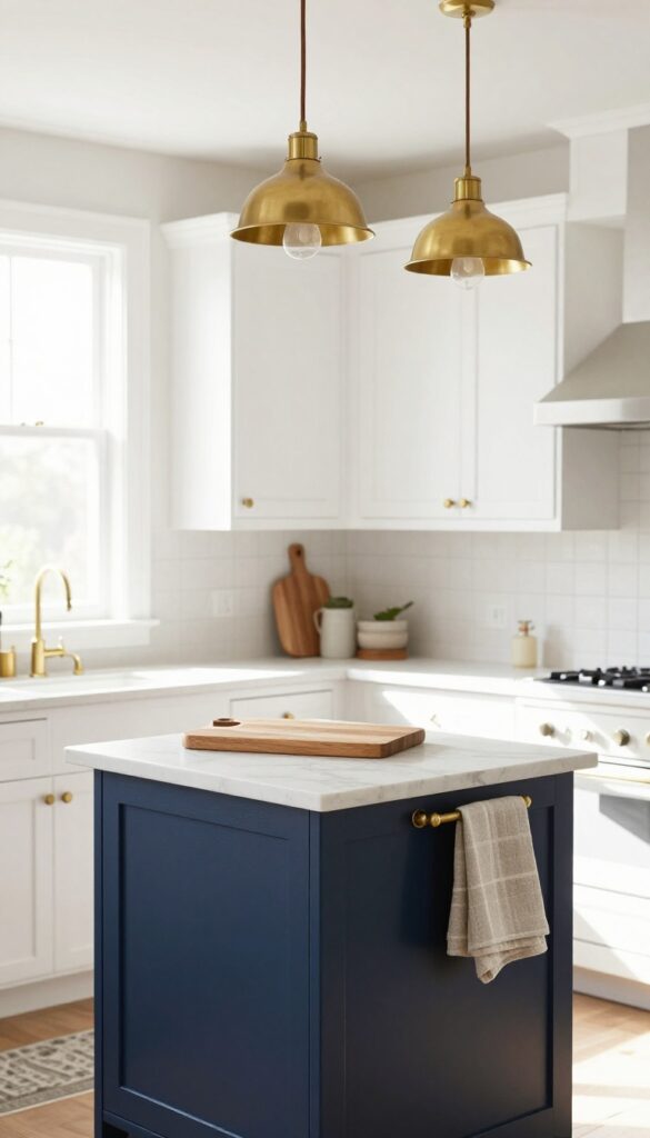
Deep navy on your kitchen island or lower cabinets brings a richness that doesn't overwhelm the space. It's bold but grounded, adding depth without making the room feel dark or closed in. Pair that navy with warm brass hardware, a faucet, and maybe some pendant lights overhead, and you get this gorgeous contrast that feels both classic and current.
The brass glows against the dark blue, especially in natural light, giving the whole kitchen a warm, lived-in vibe. Keep your upper cabinets, walls, and countertops light—white or soft cream works perfectly—so the drama stays balanced and the room feels open.
Why It Works
The combination of deep navy and warm brass creates a sophisticated yet approachable look. Navy acts like a neutral but adds personality, while brass introduces warmth that prevents the dark color from feeling cold. Light surfaces around it keep the kitchen bright and airy.
Best For
This palette is ideal for kitchens with good natural light or those where you want to add character without a full renovation. It works especially well in traditional, transitional, or modern farmhouse styles.
Styling Tip
Stick to unlacquered brass for a more relaxed finish that develops a patina over time. Mix in natural textures like a wood cutting board, linen dish towels, or a jute runner to soften the look even more.
4. Warm Beige and Olive Green
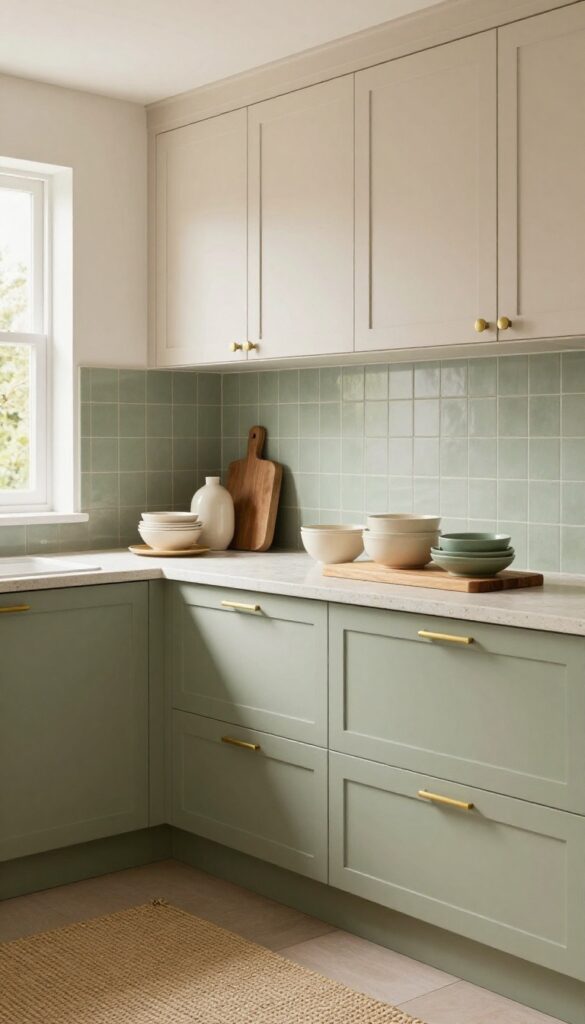
There’s a reason why nature-inspired palettes never go out of style—they just feel right. Pairing warm beige cabinets with olive green walls or a green tile backsplash brings that grounded, earthy calm into your kitchen without making it feel heavy. The beige keeps things light and airy, while the olive adds a rich, organic depth that makes the space feel collected over time.
It’s the kind of color combo that works whether your kitchen gets tons of natural light or leans a bit cozier.
Why It Works
Beige and olive are both warm, muted tones that play well together because they share an underlying earthy base. The beige acts as a neutral anchor, preventing the green from feeling too bold or overpowering. Olive green, in turn, adds visual interest and a subtle pop of color that keeps the kitchen from looking flat or washed out.
Best For
This palette is ideal for kitchens with natural wood accents, stone countertops, or any space where you want a relaxed, lived-in feel. It’s especially flattering in open-concept layouts because it bridges the gap between the kitchen and adjoining living areas without clashing.
Styling Tip
Bring in texture with linen curtains, a woven rug, or open shelving with ceramic dishes in cream and sage tones. Natural stone countertops—like limestone or soapstone—reinforce the organic vibe. For hardware, brushed brass or matte black knobs add just enough contrast without stealing the show.
5. Dusty Rose and Charcoal
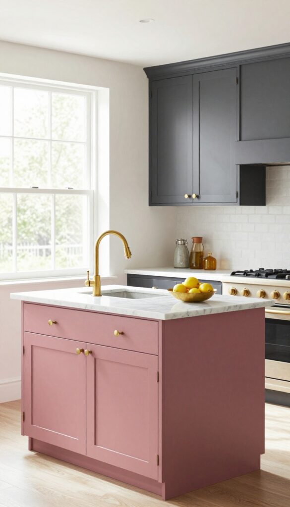
There's something about dusty rose that feels like a warm hug—it's soft without being sweet, and it brings a gentle energy into the kitchen. Pair it with charcoal gray cabinets, and you've got a combo that's both cozy and grounded. The pink keeps things from feeling too dark or serious, while the charcoal gives the room a solid anchor.
It's the kind of palette that feels unexpected but instantly right, like it was always meant to be there.
Why It Works
Dusty rose is a muted pink that adds warmth without screaming for attention, so it won't overwhelm your space. Charcoal gray acts as a neutral powerhouse, making the pink feel intentional rather than random. Together, they create a balanced contrast that feels sophisticated but still approachable—perfect for a kitchen where you want both style and comfort.
Best For
This palette works especially well in kitchens that get good natural light, because the rose can really glow without feeling heavy. It's also great for open-concept homes where you want the kitchen to feel connected to adjoining living areas—the charcoal ties into modern neutrals, while the rose adds a personal touch.
Styling Tip
Bring in brass or copper hardware and light fixtures to bridge the two colors. Think brass cabinet pulls, a copper faucet, or even a small brass fruit bowl on the counter. These metallic accents add a little sparkle and help the dusty rose and charcoal feel like they belong together.
6. Butter Yellow and Soft Gray
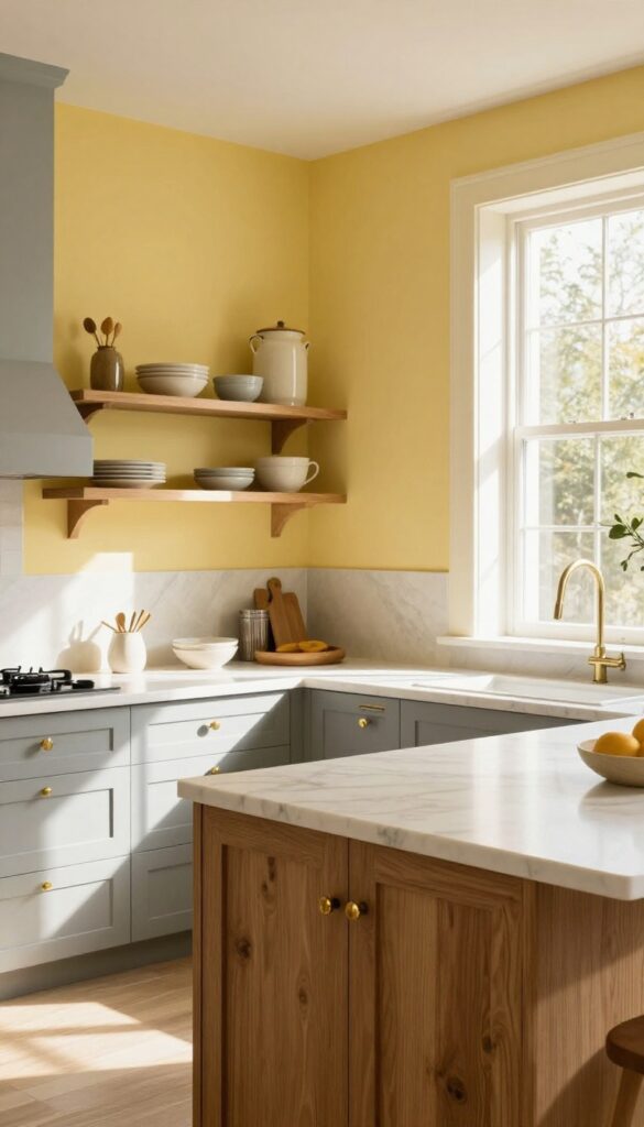
There’s something about butter yellow that instantly makes a kitchen feel like the sunniest room in the house. It’s warm without being overwhelming, cheerful without screaming for attention. Pair it with soft gray cabinets or countertops, and you get a space that feels both inviting and polished—like a cozy café you never want to leave.
Why It Works
Butter yellow brings warmth and energy, while soft gray grounds the look and keeps it from feeling too sweet or childish. Together, they create a balanced palette that feels timeless but fresh. The contrast is gentle enough to live with every day but still has enough personality to make your kitchen stand out.
Best For
This combo shines in kitchens that get plenty of natural light—the yellow glows even more in sunlight. It’s also perfect for homes with an open floor plan, because the gray helps the kitchen blend seamlessly into adjacent living spaces without feeling disconnected.
Styling Tip
Go for a matte finish on both colors to keep the look soft and modern. Add touches of natural wood—like open shelves or a butcher block island—to bring in texture and warmth. Keep hardware simple: brushed brass or unlacquered brass knobs add just the right amount of shine without competing with the yellow.
7. Taupe and Cream with Black Details
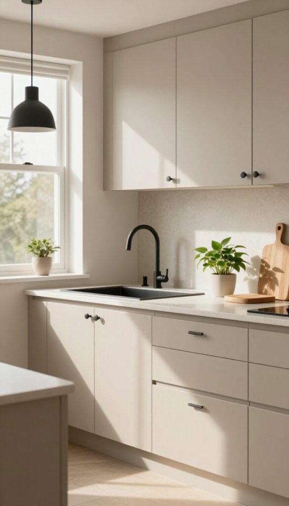
There’s a reason taupe has become such a popular neutral in kitchens—it’s warm without being beige, and it pairs beautifully with cream. When you use taupe on the cabinets and keep the countertops a soft cream, you get a backdrop that feels rich and grounded, not stark or cold. Add black hardware and light fixtures, and suddenly the whole space has structure and personality.
A few potted herbs or a trailing pothos bring in just enough green to keep things fresh.
Why It Works
The combination of taupe and cream creates depth without going dark, so the kitchen still feels airy but never sterile. Black details act like punctuation marks, giving the eye clear points of focus. This palette is forgiving—it hides everyday smudges better than white cabinets do, and it works with almost any countertop material.
Best For
This idea is perfect for kitchens that get lots of natural light but also want to feel cozy. It’s especially good in open-concept homes where the kitchen flows into a living area, because taupe bridges the gap between warm wood tones and cooler grays.
Styling Tip
Stick with matte black for hardware and fixtures—it feels more modern and less flashy than polished black. For the faucet, choose a gooseneck style in black to echo the cabinet pulls. Add warmth with wooden cutting boards or a live-edge shelf above the sink.
8. Rust Orange and Deep Teal
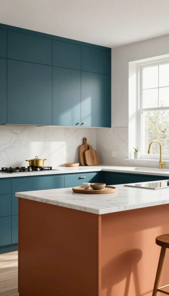
This pairing feels like a warm autumn afternoon meets a calm ocean evening. Rust orange brings energy and coziness, while deep teal grounds the space with sophistication. Together they create a kitchen that's both inviting and memorable without trying too hard.
Why It Works
Orange and teal sit opposite each other on the color wheel, so they naturally complement each other. The rust tone adds warmth that makes the room feel lived-in, while the deep teal prevents it from feeling too hot or overwhelming. It's a balanced contrast that feels intentional but not matchy-matchy.
Best For
Open-plan kitchens where you want to define the cooking zone without walls. Also great for kitchens with lots of natural light—the colors really pop in sunlight. Works in both modern farmhouse and mid-century inspired spaces.
Styling Tip
Use rust orange on a single statement piece like an island or range hood, then paint perimeter cabinets in deep teal. Keep countertops and backsplash neutral—white marble or light quartz works beautifully. Add warm brass hardware and a few wooden cutting boards to tie it all together.
9. Soft Lavender and Warm Gray
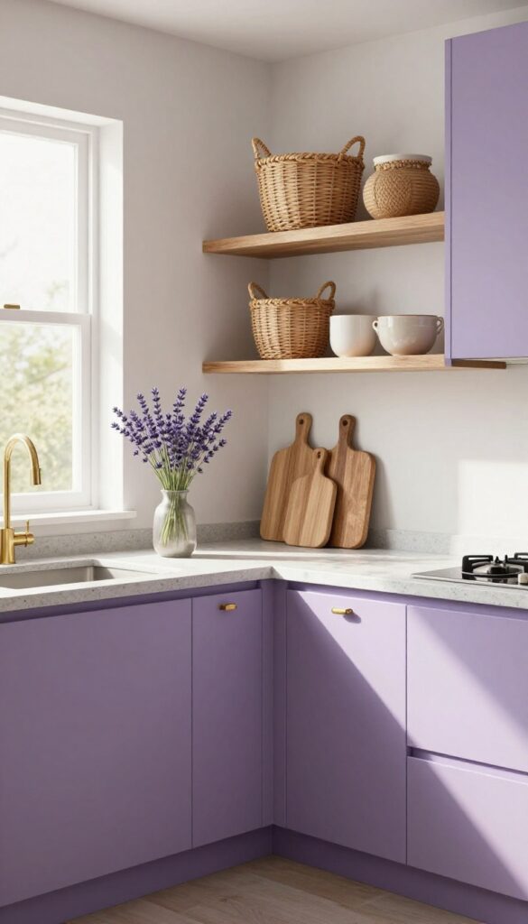
There’s a certain quiet charm to lavender that doesn’t scream for attention. Paired with warm gray, it becomes the kind of kitchen color scheme that feels both soft and grounded—like a cozy cottage that still manages to look put together. The lavender brings in a gentle pop of color without overwhelming the space, while the warm gray keeps everything feeling balanced and lived-in.
Why It Works
Lavender is naturally calming, which makes it a great choice for a room you spend a lot of time in. Warm gray adds enough weight to prevent the palette from feeling too pastel or juvenile. Together, they create a soothing backdrop that works with natural light and feels inviting rather than sterile.
Best For
This palette is perfect for cottage-style kitchens, small breakfast nooks, or any kitchen where you want to encourage relaxation. It also works beautifully in kitchens with lots of natural wood accents or vintage touches.
Styling Tip
Use lavender on lower cabinets or an accent wall, and keep upper cabinets and countertops in warm gray. Add brass or copper hardware for a touch of warmth, and bring in natural textures like open shelving with wooden cutting boards or woven baskets to keep the look from feeling too sweet.
10. Muted Clay and Ivory
There’s something grounding about a kitchen that feels like it’s been there for decades, even if it’s brand new. Muted clay on the lower cabinets brings that earthy, sunbaked warmth you get from terracotta pots or desert landscapes. Pair it with creamy ivory uppers and a matching backsplash, and suddenly the room breathes—light bounces around while the lower half keeps everything cozy.
It’s a palette that feels both timeless and lived-in, like the kitchen of a well-loved farmhouse that just happens to be perfectly styled.
Why It Works
The contrast between the two tones creates visual interest without being jarring. Clay anchors the space, making it feel substantial and warm, while ivory keeps things from feeling heavy or closed in. Together, they strike that hard-to-find balance between cozy and airy.
Best For
This combo is ideal for kitchens that get plenty of natural light—the ivory will glow during the day, and the clay will feel rich and inviting in the evening. It also works beautifully in open-concept homes where you want the kitchen to feel connected to living areas without shouting for attention.
Styling Tip
Bring in natural textures to reinforce the organic vibe. Unfinished wood cutting boards, woven baskets, and matte ceramic canisters on open shelves add layers without clutter. A simple linen runner or a few potted herbs on the windowsill complete the look.
FAQ
What's the best way to test a kitchen color palette before committing?
Paint large swatches on foam boards and move them around the kitchen at different times of day. Live with them for a few days to see how the light changes the colors. For tile or countertop samples, place them next to your cabinet color to check harmony.
How do I choose a kitchen color palette that won't feel dated in a few years?
Stick with classic neutrals as your base—like warm whites, beiges, or grays—and add trendier colors through easily changeable elements like backsplash tile, accessories, or an accent wall. That way you can update without a full renovation.
Can I mix warm and cool tones in the same kitchen?
Absolutely, but do it intentionally. Use one dominant temperature (warm or cool) for larger surfaces like cabinets and counters, then add small accents from the opposite temperature. For example, warm wood cabinets with cool blue accessories can look balanced if tied together with a neutral.
What are some low-commitment ways to try a new color palette?
Swap out cabinet hardware, add a colorful rug, change your dish towels and small appliances, or install peel-and-stick backsplash tiles. These updates are affordable and easy to reverse if you decide the palette isn't right.
How important is lighting when choosing kitchen colors?
Very important. Natural light can make colors look different throughout the day, while artificial light (warm vs. cool bulbs) also shifts tones. Always test your colors under your actual kitchen lighting before making final decisions.
Conclusion
Finding a kitchen color palette that feels pulled together doesn't have to be complicated. Start with one idea that speaks to you, then build around it with textures and finishes that feel natural in your space.
The best palettes are the ones that make you want to spend time in the room. Remember, your kitchen should reflect your personality and how you actually live.